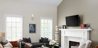
Modern homes often suffer from being overly stuffed with furnishings, trinkets, and an assortment of other things. Too much stuff! The solution is not always just to remove some items because then it may leave you as a homeowner with too few places to sit, store personal mementos, or other things of interest.
The minimalistic design needs to be carefully done so that it enhances the space, rather than leaving it feeling empty or like something is missing. Here are six minimalist design tips for a modern home to move you in the right direction.
via Patterson Custom Homes Architect: Brandon Architects Interior Designer: Tru Studio Photographer: Manolo Langis
-
Replace the Balustrade
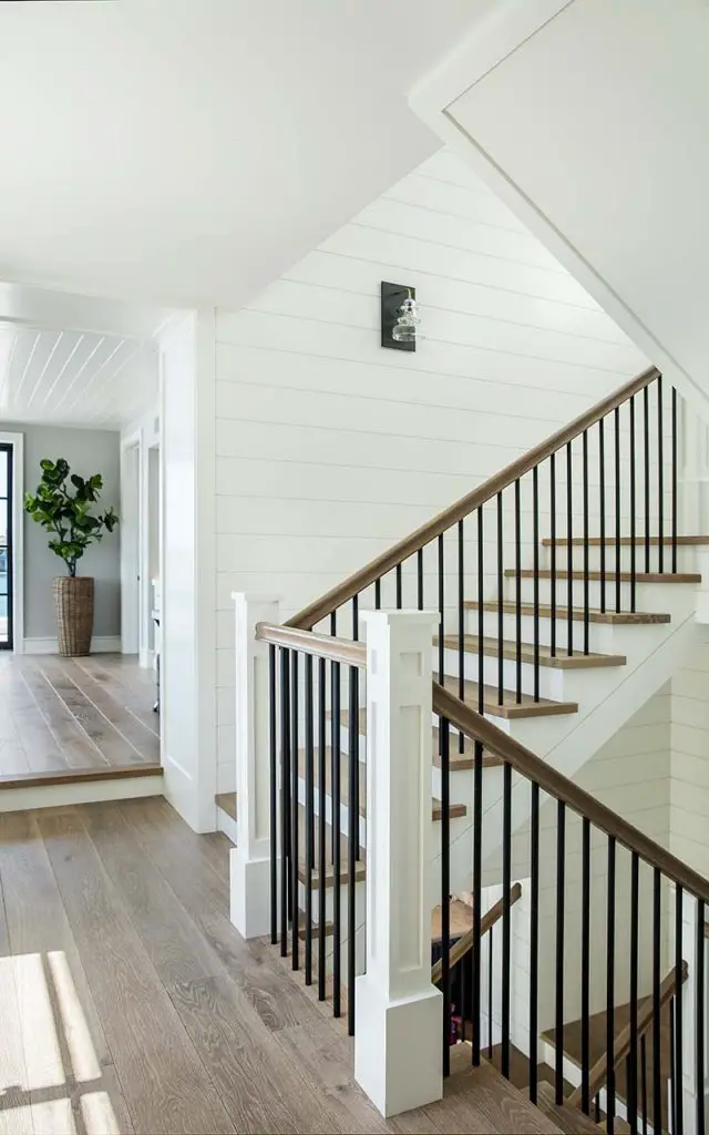
The balustrade – the railing and bars that attach to the stairs for safety and decorative purposes – are often overly fussy or don’t present well.
A new glass balustrade, on the other hand, provides a pleasing complement to a flight of timber stairs. It allows light to shine through the area that once was previously hidden.
When you try glass balustrade designs from Majestic Stairs, they find a design solution that fits into the existing staircase and complements it. The see-through nature of the glass balustrade stops any previous blocking of the view and gives the staircase a more open plan feeling to it.
via Patterson Custom Homes Architect: Brandon Architects Interior Designer: Blackband Design Photographer: Manolo Langis
-
Let in Natural Light
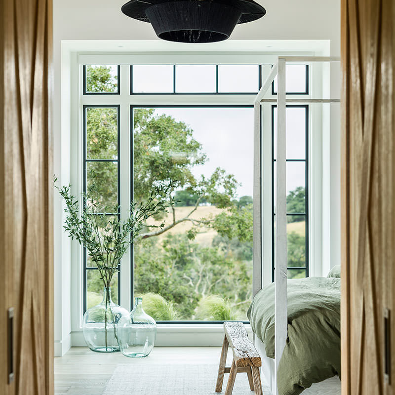
Rather than continue with a closed-in space, make a purposeful effort to let in as much natural light within the property as possible. This means in every room, open area, and living space.
The light will make you feel more alive and instantly gives the home a brighter, more spacious feeling, even before any furnishings have been moved anywhere. It’s a neat trick and it’s all in the mind.
Look for any obstacles in each room that are currently blocking the light. This could be a tall plant that’s positioned near the window, furniture up against a wall or window decorations that inadvertently are blocking out sunlight. Find another place for them or, where appropriate, remove them entirely.
-
Reflections Are Your Friend
Using mirrors to reflect light around rooms to make them feel light, airy, and more expansive. Mirrors will also reflect back places in the home that are too cluttered.
They need to be positioned well to capture sunlight and share it. But think about the time of day and where the sun will be at that time too. Test it out before positioning each mirror. This way, you can reflect light based on the different times of the day, depending on where you place them. It’s almost like a dimmer switch because the sun is stronger or less so as we move through the day, which allows greater control when setting up.
-
Function over Features
Look at the functional use of a space or room. How it is laid out now and does it best serve that need? Likely it doesn’t, yet.
For instance, if it’s a home office that you work in for a few hours a day, then what best facilitates your productivity? If it’s peace and quiet, which isn’t always achieved, then consider soundproofing the office. Adding a rubberized mat to the floor and acoustic panels to the walls will do much to dampen any vibration and sound emanating from outside the room.
Is it a living room where people gather? Or a reading nook where just one person sits alone? Match the purpose of the area, minimally cover what’s required, and remove anything superfluous to that end.

via Patterson Custom Homes, Architect: Brandon Architects, Interior Design: Churchill Design, Photographer: Chad Mellon
-
Don’t Be Afraid to Use a Storage Centre
It might be that you cannot envisage changing how the space will be used until it’s been cleared of the many things cluttering it up. This is not uncommon.
Indeed, people faced with an empty home that’s on the property market find it difficult to imagine furnishings there. This works the opposite way too. As humans, we love storytelling but we’re not always as imaginative as we once were as children.
Never mind. The way around this is to use a storage centre temporarily – don’t panic! – to store the excess to clear down the rooms to a manageable level. It depends how stuffed they are as to what degree it’s necessary to peel away the furnishing layers to begin again. Then you can reimagine a minimal design better at that point.
via Patterson Custom Homes Architect: Brandon Architects Interior Design: Churchill Design Photographer: Ryan Garvin
-
Use Multi-Purpose Furnishings
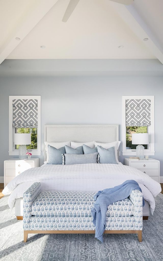
Use multi-purpose furnishings that serve one central purpose but have a second one too. Be flexible as to what is acceptable to embrace minimalism more.
You may find that it’s necessary to adjust bit by bit rather than to make radical changes that might be too much for you. Pace yourself if you tend to find change difficult to accept at first.
Also, see what furnishings fit into smaller spaces. Avoid the need to “go big” with a desk or a table when something smaller will do fine. It’ll be less expensive and there will be free floor space. This, in turn, will make each room feel larger than it is.
Embrace minimalistic design ideas to reduce the cluttered feel and lack of space at home. Once you start, you’ll be peeling it away to get some breathing room. Thanks to Majestic Stairs for consulting

