My curtain conundrum – part two…

So a HUGE shout-out and thank you to Christine of Design with Christine. She’s a CA based interior designer, and I’m in the process of designing her website for her. Last week she was kind enough to come up with an AMAZING solution for my little living room, in my little apartment, which I moved into about a month ago.

First, here’s what we’re dealing with.
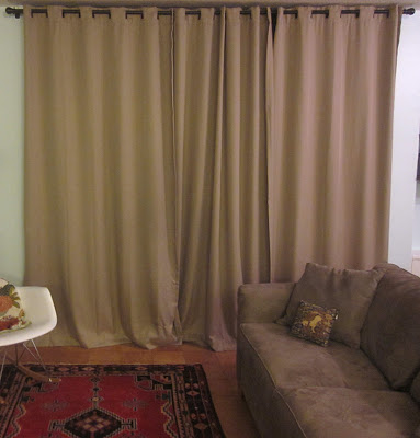
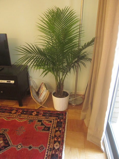
Current living room situation. The couch with the tan curtains.  yuck. The couch is nice because it’s a color that can look olive green in certain lighting, gray in others, and sometimes tan in others.
The rug is from Iran.  I really love it, but am thinking maybe a larger rug would fit this area better.  I love sisal, so I have my eye out for one I’d like – preferably with a black border. Behind the couch is a nook for my home office, and at the opposite end of the couch is our dining nook. The couch faces a wall with our TV and a bookshelf.

It’s hard to tell, but the walls are actually a light aqua/robin’s egg blue. (please pardon my currently untamed cords)

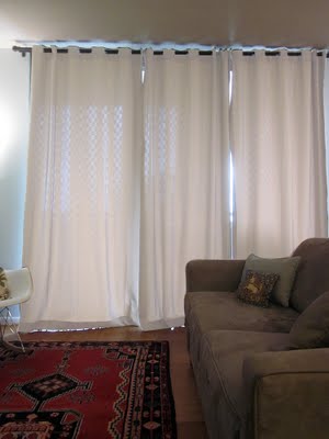
Last week, I published a post asking for some suggestions for a better curtain color.  My natural inclination was to turn to white – and some of you agreed.  The below is my curtains which I photoshopped white.  I liked it, but I did think something was missing.  I didn’t get that “yes” moment from this image.
Without further ado here’s what Christine suggests:

“Ashley,
First of all I want to say how super amazed I am at the photoshop job. That is pretty cool! I wish I could do that. I had two semesters of photoshop in college- but it didn’t stick. However- the solid white curtains are not so cool. Why?
1. There is a disconnect between the rug, furnishings and curtains. Nothing is bringing them together. You need a unifier.
2. You need more pattern in the room. The strong pattern in the rug is off balance when it is the only pattern around.
3. You need more color in the room. Add color in the curtains, and also some throw pillows. There needs to be repetition of color here and there.
The good news? You can be done by this afternoon. I selected everything form West Elm.
You can still have your drapes light and airy- but add pattern and color.”

Christine’s West Elm picks: 


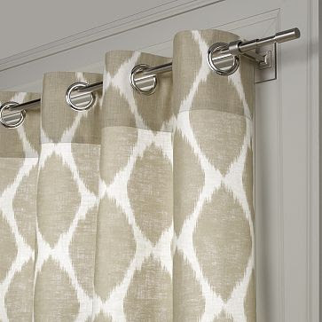
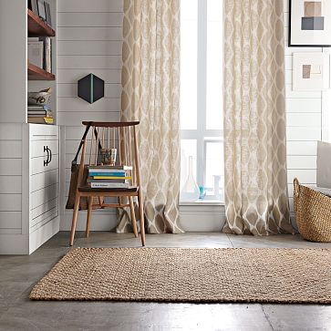
love these ikat curtains…

Christine continued 

“I would add to these a black canvas tape on the edge.  Keep in mind that when I say “color” beige is a color.  😉  Your window treatments should also be layered.  Add some black woven blinds to be the first layer.

Another exercise you can do is visually draw a horizontal line across the room.  Do you have balance?  Balance with color?  Balance with pattern?  Notice how in the room shot above, (and I know there are many angles we don’t see)- there is a lack of balance.  All of the color and pattern are on the bottom of your horizontal line.  Another good reason to use patterned drapes.  The black woven shades will also bring more visual weight into the upper portion of the room, improving your currently bottom heavy lack of balance.  (awesome tip!)

Now- bring in more of your rug colors in some throw pillows.”

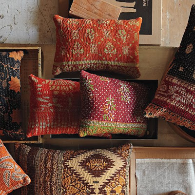
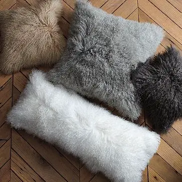
and love the quilted pillows!!! Christine continued:

“Use one of these.  See the one on the right that is cut off that has the red and black in it?  I thought that would go great with your rug. 

You have white walls and that white needs to be brought into your room more.  (Except not in solid white drapes.  😉

Add a white pillow to the mix.

Didn’t she come up with some awesome suggestions?!?
Definitely check out her blog – Design with Christine, where you can see the original post.

So, I did a quick photoshopping of what the curtains will look like…
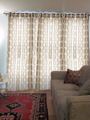
I even added one of the quilted pillows.  I’ll add lots more pillows to the couch, but I’m going to sew covers for them after I have new curtains.

I also originally planned to sew curtains – but I’m not sure if I’ll beable to find an affordable fabric that’s less expensive than just buying West Elm’s.  The windows are quite large.  I’ll need about 3 yards for each panel (3 panels).

I though this fabric was pretty close…and it’s only $11/yd. on etsy.  What do you guys think?
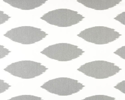
It’s definitely more gray, and has a higher percentage of white – but I think it will go well.

I had some other great suggestions from readers  (thanks!!).  One reader suggested a blue ikat – see below
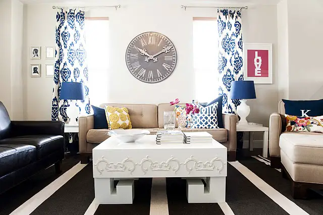
via 6th Street Design School
I really like this as well – but as $23.99 a yard (from Calico Corners) it would be more expensive to make these than to buy the West Elm curtains. I’m also a bit afraid of so much contrast..hmmm..it’s so pretty though..
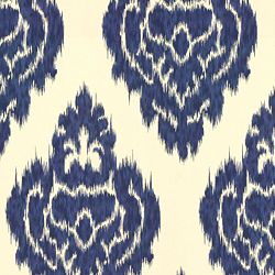
So, again – a HUGE thanks to Christine – you’re suggestions are spot on.  I will definitely post pictures when I’ve either made or bought curtains.

Thanks all and more suggestions/ideas are welcome!

LEAVE A REPLY

This site uses Akismet to reduce spam. Learn how your comment data is processed.