
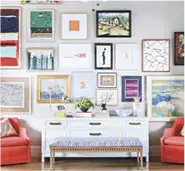


Colour is something we really need to think about when it comes to decorating our spaces. You’d be surprised, but colour really makes a huge difference to a room, particularly when it comes to relaxing in it.
We all need time to relax these days, and our homes are the best opportunity to do that. So you need a calm environment, and calming colours on the wall. Getting the right colour can be vital, especially if it is so vital to putting you in the right mindset.
More and more of us are facing the likes of anxiety, depression and addiction, potentially even going through a rehab clinic to get back on a solid pathway, so ensuring you can maintain peace, relaxation and manage any stress is vital.
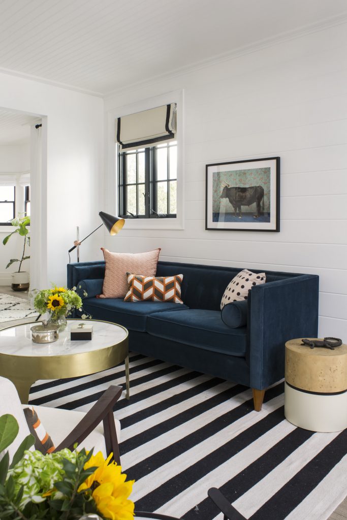
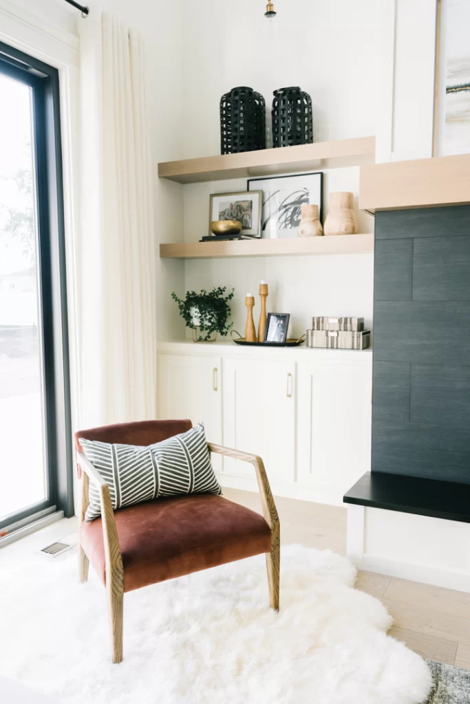
Colours such as beige, greens, blues, whites and pastel shades are perfect for this, but there are colours you should avoid to…
Red
Red is a bright colour that is vibrant and gives off a sense of energy. It isn’t one that screams calm, but one that has more of an effect of danger and power.
It’s an intense colour, and during an evening when you’re wanting to kick back and relax bright reds in the room isn’t going to allow you to do that.
Black
It’s perhaps no surprise to see black on the least. Black is never going to be a colour that evokes a mood to relax. In fact, it has quite the opposite effect, bringing in elements of negativity, sadness and fear.
A large amount of black in a room for anyone that does suffer with mental health issues, can be really detrimental to a person’s health.
Purple
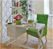
We love purple, and there is certainly place for purple in a home. It’s a regal colour but one that also is great for improving creativity. Purple is great for in work spaces, play rooms and other areas where it’s good to be creative and have that extravagant flourish.
Orange
Orange is bright and energetic, so again there’s a place for it but that’s not in a space where you need calm and tranquility. Orange grabs the attention when really what you need to be focusing on is yourself, or perhaps even a book as your brain drifts away into a relaxed state.
Brown
Similar to black, brown is a colour that can be dreary, dark and a little depression. It can often make people feel isolated, and while solitude can be good when it comes to relaxing, combined with the other emotions it evokes, it’s not among the most calming out there, for any space.


