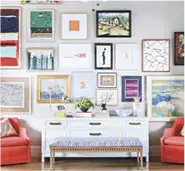
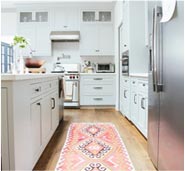
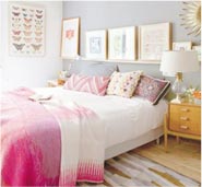
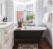
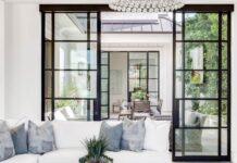
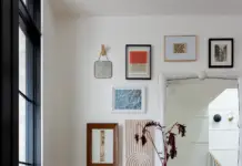
It’s likely that your passion for interior design doesn’t stop at interiors. If you’re anything like me, your passion for interior design translates into a passion for many other types of design as well, be it textile design, landscape design, graphic design, or web design. Since I am a Washington DC freelance web designer by day, my passion for design spans from interior, to graphic, to web, etc. I thought it might be cool to explore how you can bring in elements of another form of design you love into your home via your passion for interior design. Since I have a passion for web design, I am going to use 3 web designs, specifically email marketing campaigns, as they are often something I have to design for my clients. The 3 designs below were rounded-up by Campaign Monitor, so a big thanks to them for showcasing how great design, whether it be interior or email marketing, can inspire.
Web Design – Email Campaign 1: Birchbox
I looooovvvveeeee beauty products and samples. When I pamper myself I feel like I’ve been diligent in self-care. This is one reason I’m a fan of services like Birchbox. Not only do I love their concept, I love the design they bring even into their communications.

Style: Feminine and Joyful
Drawn to the design above? Then you probably like things with feminine, fun, and colorful appeal. Try to use similar elements in you home.

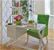
I’m assuming that if you liked the web design above, you probably also like the room above. I uses bright happy colors and other feminine design details, like furniture and lighting with thin legs and stands.
room above via decorisme
Web Design – Email Campaign 2: Seafolly
Who doesn’t love effortless and impactful? To me that is the essence of the design aesthetic of Seafolly. It effortless and impactful is also a favorite way to design my home. I like things clean and minimal, but with enough details or placement of art to make a space really have impact.

Style: Minimal artistic
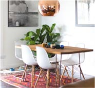
I don’t think it’s a leap to say that if you like the web design above, you would also like the interior design below.

via Architectural Digest
The design above focuses on impact, but through quality materials and striking artwork.
Web Design – Email Campaign 3: Living with Homestyle
The classics are so for a reason. The web design below follows a classic grid in classic contrasting colors.

Style: Classic with Contrast

The pink tufted bench above is the perfect example of bringing contrast into an otherwise neutral interior, and the tufting brings in a touch of the classic! Thank to Campaign Monitor for collaborating with us!

