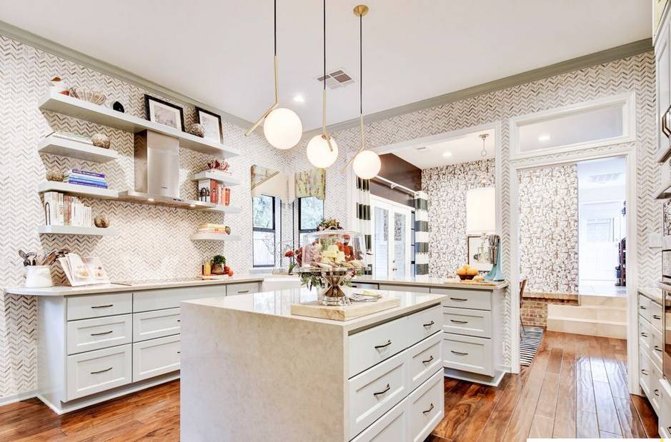
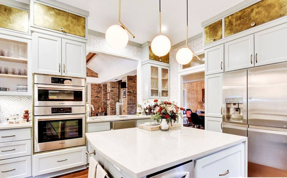
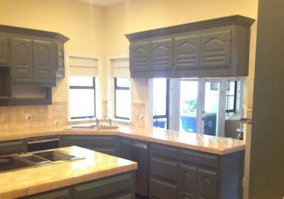
Everybody likes a good before and after. And this kitchen renovation is one of the most dramatic transformation I’ve see. But is this kitchen makeover too over the top? I can’t decide. It is undoubtedly beautiful, but at the same time I feel like I just walked in to a high end designer shop where I shouldn’t touch anything lest I smudge it.
I do really like the chevron wallpaper, I’m just not sure if I like them throughout the whole kitchen.
The kitchen is the work of Lieve Saether, Owner at Turnstyle Design LLC. The kitchen is her own.
Open shelves in the kitchen are a popular way to add more kitchen storage
I am not a big fan of the brass-looking top cabinets. I do really like the soft greenish white on the other cabinets.
Read the whole story and see all the pictures from the source.

