


Kindred Spirits Christmas Countdown on “Live Creating Yourself” – featuring Yours Truly!

I want to thank Alaina of Live Creating Yourself for being so kind as to think of me to fill out her Christmas Questionnaire.The lovely collage she made of images for DecorologyThese were the questions:1. My home isn't decorated for the holidays until...2. My holiday spirit soars when I hear the song...3. If I had to be anywhere but...
A personal post: Remembering Cody a year later

A year ago today the saddest event of my life took place. My 8 year old Australian shepherd, Cody, succumbed to lymphoma, just a month after his diagnosis and after one round of chemo. His weight had dropped down from 40lbs to 25lbs in just a few months. He went from a happy, lively deer and chicken chaser...
Last minute gift ideas for everybody!

Time is running out my friends! Here are some last minute goodies I think would make good gifts!Stocking Stuffers:Drink Me Tags.comFor her:This gorgeous clutch is only $12! From Toon Designs on EtsyA charming Dahlia sash from EmersonMade.For the pooch:A Michael Vick chew toy!Gift GeniusFor the little people, adorable Nightmare Snatchersvia Spiderbite Boutique on EtsyFor him:The "cable box," for...
Period houses galore – people who live in centuries old homes

I literally stumbled across the site, Period Properties the other day, and down the rabbit hole I fell! It's like flipping through a fairy tale and seeing how people - rich and poor, lived hundreds of years ago. The catch is people live there now, have tried to preserve the character of the home, and tell their renovating stories.unrealI...
Fun reader question – ideas appreciated!

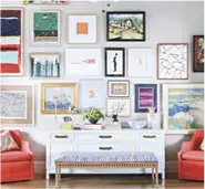
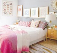
So, Laura posed this question to me awhile ago and I've been compiling ideas for the last couple of weeks:"We're about to get an antique brass bed from my parents, but it's beenreally hard to find examples of similar being used in well-appointedbedrooms! So I was wondering, have you seen any great examples of thisstyle?(I'm also hoping to go...
A really great giveaway!!! Alfi thermal carafe from All Modern!

Boy do I have a treat for you guys! All Modern.com is graciously offering this really fun (and functional) Alfi thermal carafe to one of you! In order to win, go to All Modern and pick out one other item that you'd like to have. Come back to this post and list the item, along with your...
Check out my 2010 design resolutions on Discover Interior Design

...and a big thanks to Kristin for asking me to do this!Here are two of my resolutions - Click here to read/see them all!via MielBakesKeep things organized! I spent a lot of last year creating (through a lot of trial and error) and organization system that works for me. Once set up, it’s easy to maintain and...
A romantic turn of the century style home with a modern flair

I don't really know how to describe this home. It's featured in Skona Hem, so it features smart Scandinavian style, but it also looks like it could be a home from a fairy tale, or even a doll house. It looks like a home in a period film but at the same time features modern wallpaper, lighting,...
Amazing DL&Co. Candle sale going on at rulala!

Hurry stuff is selling out fast!Use this link for free membership if you aren't already a member -
Cool modern gifts for the hard to impress

From the very cool store, Mocha. Here are some of my favorites for Christmas.I've had my eyes on these nesting mixing bowls for awhile!A ceramic notepadThey also have these in white! Soooo cute and kids would love themAdorable pot holders!This piece of notebook paper is actually a tea towelThis is to scale, it's a teacup stool!There more online...