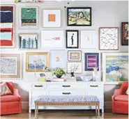
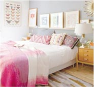
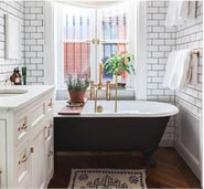
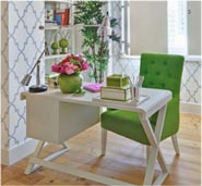
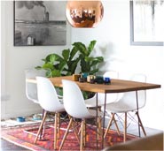
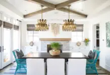
Gorgeous living rooms in all styles

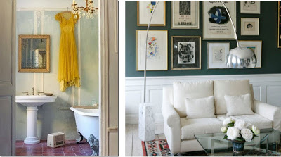
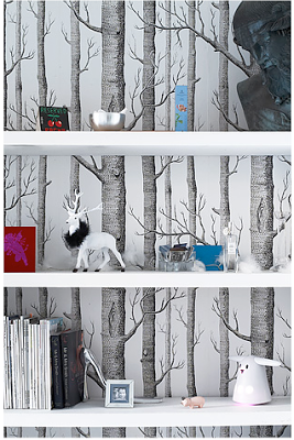
I thought today I’d just grace you all with some living room beauty. Enough said?


images above via HomeLife

via Dwellings & Decor via Made by Girl

via Dominio

Some granny chic
via Decor8 Tumblr

I’m way too shy to use this color, but I love it in this room!
via Benjamin Moore

via Beluah Designs

A great candle for warmer weather


I was so excited to receive a Jo Malone “Vanilla & Anise” candle last week, which is part of a new fragrance line including cologne, bath oil, body creme, and a home candle. When I first opened the candle, the scent was a little strong, but I soon realized it was only because it was just opened. Now the candle is perfect for freshening up the room, and I’ve found it especially great for cleaning up bad odors. Example? This weekend a friend was working on his car in the garage and the engine flooded – EVERYTHING smelled like gasoline, even my freshly washed clothes. I kid you not though – the candle really helped alleviate the overpowering smell of gasoline.


The Vanilla & Anise scent is surprisingly complex, but I’d summarize it as a “woodsy sweet” scent. The release reads “the fragrance inspired by the floral landscape of Madagascar, capturing the fleeting moment that the rare vanilla orchid blossoms….blends notes of bergamot, neroli and star anise to create a touch of spice sparkling above transparent layers of delicate vanilla orchid and frangipani. The warmth of vetiver, white amber, and the subtlest hint of clove complete this unexpected, modern story of vanilla.”

Now these are a lot of elements I’ve never heard of, but I can definitely notice different “layer” of scent based on how far or close I am to the candle. It really is lovely.


An added bonus? The packaging is gorgeous! It comes to you in a lovely box way too nice to toss bound in a smart black ribbon. The Vanilla & Anise collection is available this month at Jo Malone shops, jomalone.com, Bergdorf Goodman, Neiman Marcus, and Saks Fifth Avenue.

Apartment 2 from “2 very chic apartments..”

Now enter sister Victoria’s apartment. As you can tell, she’s very influenced by the glamor of the 50s and 60s, but with a clean traditional feel as well. I really like her color palettes.


love the chair
a gorgeous renovation for this small but great kitchen


This shot is so pretty – the narrow drawers and the hydrangea and mirror.


It’s all so pretty!

Click the image above to read Victoria’s design tips…
via Lonny Magazine

You will LOVE this stuff…

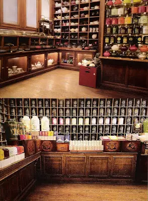
I just discovered this adorable online store, Bombay Duck. If I could register for a house warming party, I think this might be it. If I had a house. Here are some of my favs…

these are tooooo pretty!


really cute shoe boxes


pretty glass knobs


vintage tea accessories!

adorable cupcake shaped trinket boxes


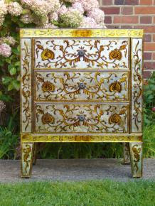
love the flower drawer pulls!
Check out all the goodies on Bombay Duck.

2 VERY chic apartments, 2 sisters

This post will be in two parts, one today and one tomorrow. I have to give these two sisters credit for both being so talented. Both of their spaces are beautiful, while showing off each sister’s identity.

The two worked together to decorate and renovate each other’s apartments. Antonia moved in first, so they worked on her place first. Both apartments needed completely renovated bathrooms. Both kitchens were also gutted as they were poorly laid out, and did not utilize space to the max. As you can see, and will see more tomorrow, both sisters are great navigators of flea markets, and you’ll see there tips below.


I really want a tiny set of library steps like these – does anyone know if/what there formal name is?


click the image below for a larger version of the Thompson sister’s tips for navigating flea markets.


Come back tomorrow for Victoria’s apartment.

via Lonny

The simply beautiful, delicately decorated Turebyholm Castle

I saw this and I didn’t hesitate to grab my favorite photos and post. The description sums it up – “With a clear sense of style and true respect for the architecture, Winnie Mølsgaard and her husband Eigil have decorated Turebyholm Castle – a small rococo castle from 1754. The home is a refreshing blend of art deco and modern Italian furniture design, alongside antique pieces, hand printed silk wallpapers and original chandeliers. However, it is the serenity and the stunning landscape that Winnie Mølsgaard mentions, when we ask her to describe life in these enviable historic settings.”


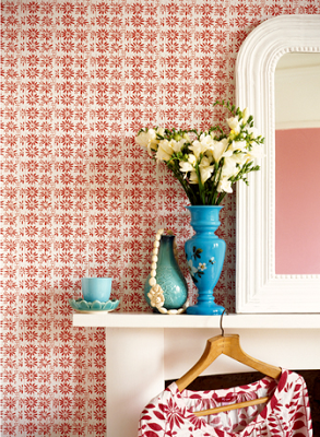
This paper is just gorgeous


so pretty…


image via KML Design (Katrine Martensen-Larsen,
Stylist/Writer)

The moody, beautiful photography of Rodney Smith

These photos speak for themselves. You’ll notice a common theme of window, which for me speak of introspection, and waiting..waiting…waiting. The empty rooms also speak of being left behind or a time and place forgotten, or neglected. Atleast for me. Do these photos have a meaning for you?


via Rodney Smith

Check out my guest post on Mochatini- featuring some modern rustic eye candy

I’m so flattered that Manvi over at Mochatini asked me to do a guest post for her blog. I’ve been a fan for a while and it’s an honor to be included!

My post featured The Crown – a 21st century inn in the heart of Woodbridge, Suffolk. What really makes this place special is the gorgeous, gorgeous interior design by Bentheim. You’ll see what I mean –


Read and see more at my guest post on Mochatini!

A great spring project that’s super easy and pretty!

For this great idea (and gorgeous photos), I thank Elizabeth Goodman, creator of the very pretty “To Be Charmed” blog.

The project’s star component is Japanese Washi tape, which is like a decorative masking tape. The tape is a fabric-like masking tape that comes in dozens of patterns, colors, and widths.


Some of these vases she’s created are actually paper cups!
Read her post for all the how-to details –

Some places to purchase the tape:

www.etsy.com/shop/PrettyTape

www.happytape.bigcartel.com/
www.etsy.com/shop/downtownfabrics
www.cutetape.com/

Some pretty spring flowers on my desk would really brighten my day! (hint to boyfriend)

A little tangent – some awesome design on the silver screen

I saw Sherlock Holmes a while ago in Boston visiting my friend Liz, and we both ended up drooling over more than Robert Downey Jr. Both of us being RISD grads, the art at the end credits left us in our seats while audience rolled out. Here are some great screenshots I found on Graphic Exchange. The end sequence was done by a company called Prologue, which coincidentally enough, another RISD friend of mine used to work for in LA. You can read about their process and see more concepts at the post on Graphic Exchange.

The board


Rachel McAdams was great in this role too – but I like all her stuff (a bit of a girl crush)


So, if you ever watch the movie stay tooned for the great work of art that is the end credits!