Category: gray

  • Proof wall to wall carpeting can be gorgeous

    Proof wall to wall carpeting can be gorgeous

    Growing up in an old farmhouse, we always had hardwood floors, so it would be hard for me to go to carpet I think.  That being said, wall to wall carpet does have it’s advantages.  Nothing beats it’s coziness underfoot, and when you have an infant who spends his day on the floor, under butt.  Also, if you live in a rental, wall to wall carpeting might be what your stuck with.  So fear not, or rejoice – wall to wall carpeting can be just as gorgeous as hardwood floors.

    Wall to wall sisal carpet paired with the black walls looks so sophisticated!

    If I were to ever go the carpet route I would want something with a modern texture in a neutral shade.

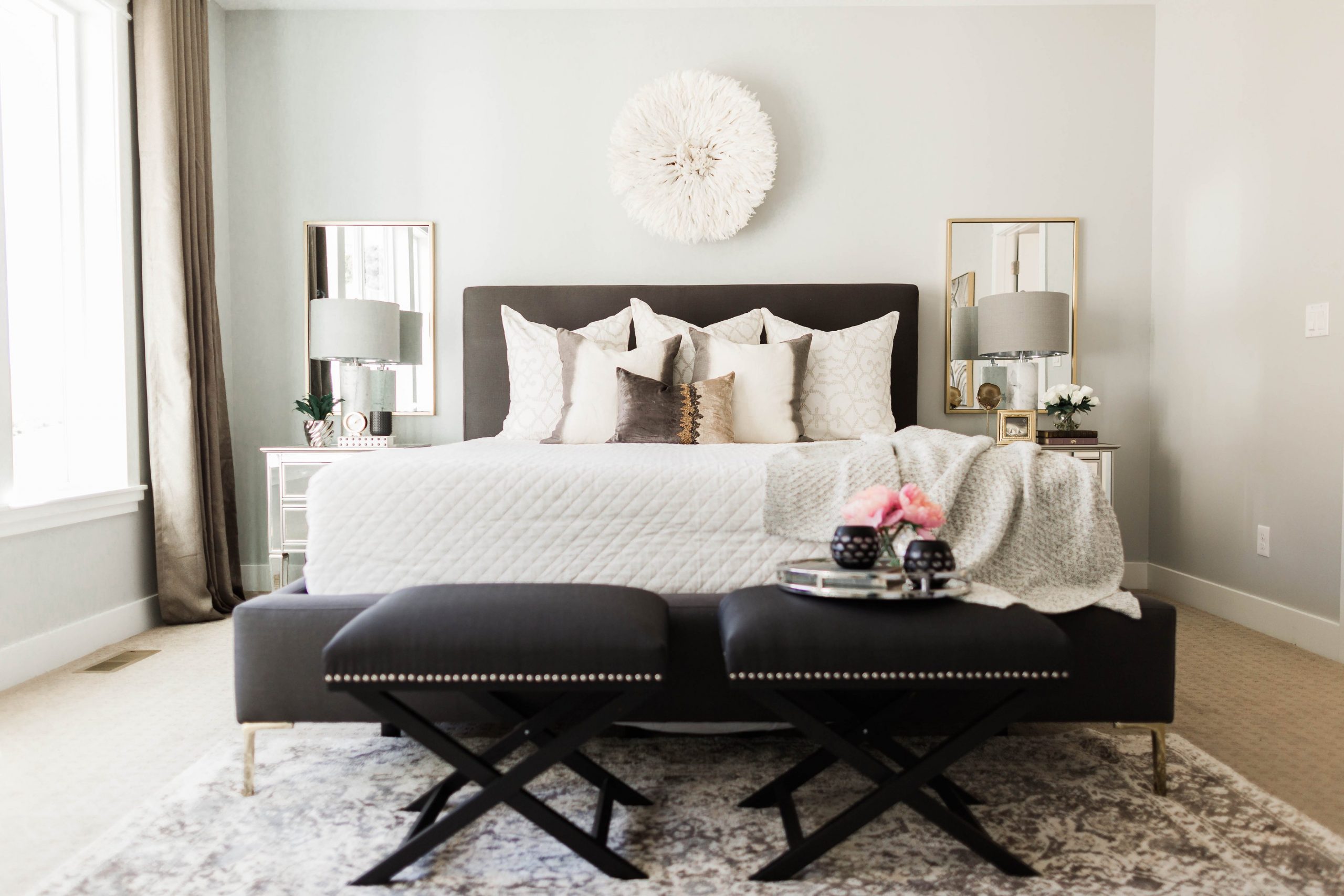
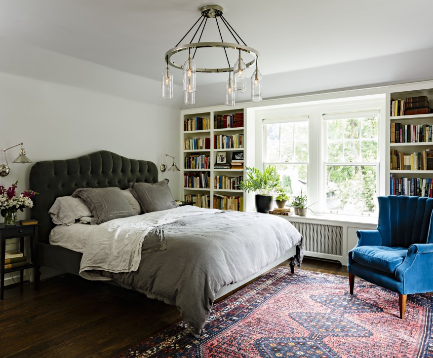
    In this neutral bedroom the carpeting adds another layer of rich texture.

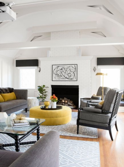
    Loving these grays with the pops of yellow.

    How dreamy and lush is this dressing room walk-in closet with diamond patterned carpet?


    Pretty pretty gold bamboo bed frame with a minimal geometric patterned carpet in gray keeps things crisp.

  • Why you shouldn’t neglect your hallways

    Why you shouldn’t neglect your hallways

    It’s not a new idea to utilize your hallways and not let them be wasted space, but some – myself included- are still guilty of this.  Now that the weather is cooling we will be spending more time indoors, therefore freeing up time to show your halls some love.

    A lot of the examples below are foyers, but entryways often pose similar design conundrums as halls, and similar solutions.
    via Pinterest 

     I love that this hallway is so glamorous but gets cheeky with the addition of a giant framed chalkboard.
    via Pic toViral

    Our hallway is narrower than this one, no kidding.  Wainscoting and a lovely collection of framed art give this hallway a studied feel.

     So, this hallway is all about amazing bones.  The vaulted ceiling is so pretty.  The horizontal shiplap creates a sense of length.
    via ?

     I love a round table in the middle of an entry.  It boasts – “hey look at all the space I have!”  It is not a boast I can make.
    via Fresh Designpedia

    If you have enough width in your hall to allow it, built-ins or shelves are a great way to display more than art or serve as additional storage.
    via Foter
    Traditional and pretty.

  • Beautiful Interiors (and great tips!) from Fixer Upper’s Joanna Gaines

    Beautiful Interiors (and great tips!) from Fixer Upper’s Joanna Gaines

    I guess I’m a bit late getting on the Fixer Upper bandwagon, especially considering they will no longer be doing the show *tear* after season 4.  Even if you don’t always love their projects, Joanna Gaines is undoubtedly wildly creative and talented, and I love the little tidbits of design wisdom and inspiration I get from her.

    Joanna keeps you guessing by always using unexpected materials in her renovations. Glass tile and wood counter tops?  A great solution for keeping a space warm but also clean and simple.

    Updating antiques is simpler than you think.  I mean, these doors MAKE this room!  And with all the furniture restoration products and tutorials out there now, learning how is simple.

    Joanna is also a big fan of mixing metals.  What really attracts my eye is the brass mixed with the wood beams.  It keeps the space from being too slick, but also too rustic.

    Gray works in every space.  I couldn’t agree more!  Joanna uses gray a lot because it creates a calm and neutral backdrop, allowing your furnishings and decor to shine.

    That teal rug with those aged leather chesterfields is to-die-for.

    Use shiplap.  Yup, if you’re a Fixer Upper fan you are very familiar with pine panelling called shiplap.  Joanna swears by it. 
    Read all of Joanna Gaines decor advice and see more at Domino.

  • Bedroom Office Inspiration

    Bedroom Office Inspiration

    Beautiful ways to have a home office in your bedroom

    We finally hired a nanny 2 days a week so I can start getting back to work.  It is wonderful to have some help finally.  Working in the evenings after Leo went to bed has been taking it’s toll.  I love being back in my home office, but hubby works from home two days a week and there may be some days when we both need to work, but only have one desk available.  So we’ve been considering putting a desk in our bedroom for him to work from on the days he works from home.  Here are some office in the bedroom ideas I found.

    You’ll notice one common characteristic of a successful desk in the bedroom is that it doesn’t try to be a standout statement piece.  It matches the bedroom’s existing style and looks like it belongs.
    via Home Portfolio

    Another characteristic is that desks are either kept very minimal and clean, or they are treated like a piece of furniture one often finds in a bedroom, like a vanity or nightstand, and decorated with lamps and picture frames.

    via DecorPad

    via Decor Chick
    The desks chairs are also kept relatively inconspicuous.

    via Lonny

    I love this example because the desk actually has a computer on it, as I imagine 98% of all desks do!
    via Timeless Wrought Iron

    Do you have a desk in your master bedroom?  If so, how have you styled it?
    via Timeless Wrought Iron

  • 2016 Interior Design Trend: Pretty Pastel Interiors

    2016 Interior Design Trend: Pretty Pastel Interiors

    Pastel interiors inspiration

    If pastels are done right, I love them.  If not, I loathe them.  The need to be cool and sophisticated, not sweet and sugary.  Below is some inspiration I found for interiors that use pastels in a fresh and hip way.

    The super soft and muted tones in the rug and on the walls are like a breath of fresh air in this LA home.

    The blush panels in this dining room are made sophisticated by the sleek black dining room furniture.  The pinks and oranges in the rug are just different enough to keep the pastels from being too matchy matchy.
    2 images above via Domino
    Pale blue and gold are always a winning combo in my eyes, and since no other pastels are competing, the landing doesn’t look like too sweet.
    Usually the pink, sherbet orange and light blue together would be too much for me, but because the rug and settee have a time worn patina I think it works.
    What do you think of the blue door?  I think the subdued purple in the rug helps tone it down.
    image above via Domino
    This space might be a little too pastel for me, but I love that rug!
    image above via Domino
    Do you use pastel in your decor at all?  If so, how?
  • The Everygirl Alaina Kaczmarski’s Chicago Apartment Tour

    A feminine pretty apartment with beautiful architectural details

    I’m a sucker for a girly home that uses pastels and whites and uses cosmetics as decor.  With hubby and a baby boy though, it’s just not in the cards.  I get my fix from perusing house tours like this one below from the co-founder and editor of The Everygirl and blogger behind Live Creating Yourself- now Alaina Kaczamarski.

    I’m starting with the home office area because that is my favorite. The lacquered parsons desk, ikea shelves, and impactful arc lamp all make for a beautiful place to be productive.

    I believe Alaina has since moved, but she lived in this apartment with a roommate and two pups.  Lots of natural light, an outdoor space, and a separate space for a home office are what made Alaina choose this rental.

    The living room is in peaceful gray with accents of black and white to add drama.  I’m loving all the decorative pillows.

    The gallery wall serves as a great focal point and helps integrate the TV into the space.

    The architectural details which include moulding and built-in bookcases are indeed beautiful. The bentwood chairs and Saarinen style table make for a pretty pair.

    Even the kitchen stays in theme with Alaina’s favorite colors, mint, pink, gray, and gold.

    Her favorite room is her pitch black bedroom.  What do you think?

    See and read the whole story at The Everygirl

  • Could you handle these colorful kitchens?

    Okay, maybe these aren’t red or bright green, but they aren’t your typical cherry or white cabinets.  My dream is still white cabinetry with marble countertops, but I might have to wait for our “forever home.”  
    These steely blue gray cabinets add a country luxe feel to this kitchen.  The pendant lighting and stools add a twist of industrial.  I love the wood topped island.
    Okay, I love these warm gray cabinets paired with white.  Between them and the herringbone floors they warm up what could otherwise be a too sterile all white kitchen.
    At first glance I thought these were white, but then I looked again.  They’re mint!  I can’t quite decide if I like them or not.  I’d like to see a backsplash and see how that sets them off. What do you think?

    We’re seeing navy everywhere these days, and I’m not complaining because it’s so beautiful.  I’d never pick that color backsplash but it really does work in the sense that it’s so subtle.  The gold open shelves are really cool too.

    Espresso?  This kitchen is beautiful, but I don’t know if I could go this dark.  I do love that raw edge island though!
    What do you think?  Do you like any of these cabinets?
  • A touch of blush!

    Today is a miserable cloudy gray day outside, so what better way to pick up and turn it around then a touch of blush?
    See more images from bold color pops & one must see kids room! on domino.com:
    via domino
    Acapulco chair, Modern Pink Planter:
    Can you picture a touch of blush in your home?
  • Tiffani Thiessen’s inviting modern Tudor home

    I love how Tiffani managed to blend the clean lines of modern design while honoring the traditional bones of her 1923 Tudor home.  See below in the house tour:

    The kitchen is what originally caught my attention.  It looks like a chef’s dream.  And unknown to me, Tiffani actually has a show on the cooking channel called Dinner at Tiffani’s  The wall of windows and white cabinetry was all custom.  The counters are Silestone.

    Love the mix of modern furniture with stained glass and woodwork from the 1920s.  What do you think of the dark ceiling?

    In the comfy living room, two area rugs break up the space into two distinct seating areas.

    images above via the story at Family Circle

    I love what I saw in Family Circle so much, that I tried digging up more pics.  I found some more at Lonny

     I’m a sucker for a good Tudor!

     Her little girl’s sweet bedroom.

    Exterior shot via Pop Sugar.

    Her closet!!!! I’m drooling…
    via House Beautiful

    Another view of that gorgeous kitchen.
    via The Food Network

    What do you think of Tiffani’s modern Tudor home?

  • House Tour: A stunning Portland Tudor renovation

    These pics pretty much speak for themselves. This space is sophisticated and warm all at the same time.

    I love the jewel tone palette combined with the soft gray walls and white casements.
    I found this project on Jessica Helgerson Interior Design.  They say:
    ” The clients for this project were a family of four who had lived for a number of years in a Tudor house atop Portland’s Mt Tabor. It had been a grand house at one time, the first on its block, built during prohibition with a speakeasy in the basement. Unfortunately by the time our clients bought the house it had suffered several poor remodels and had fallen into disrepair. Our challenge was to retain the character and charm of the house, while fixing the things that had gone wrong and reworking the layout to create rooms for a modern family that enjoys cooking, eating, and being together.”

    The interior architecture has so much charm and character.

    We completely renovated the kitchen, taking out a wall to transform it from a narrow galley into a spacious room with a breakfast nook and a generous island. The kitchen is open to an adjacent “snug room” with comfortable built-in seating, a fireplace, and a television concealed behind a paneled wall. We relocated the powder room to an exterior wall where it could benefit from an existing window. In the living room, we designed two L-shaped sofas to create a simple and inviting furniture layout, which centers around a generous coffee table and fireplace. Our design for the coffee table was inspired by the hexagonal marquetry top on the clients’ heirloom dining table, which we kept and reused.
    While I really can’t complain, maybe they went a little heavy with the oriental rugs and velvet upholstery, but it’s still amazing.  The lighting was all custom designed for the house.
    Well, what do you think about this tudor renovation?