Category: bold

  • Subtle or Bold?

    I’m in a pink and gray kind of mood today and was wondering what my readers tend to lean towards. Bold accent color or subtle ones? I sway back and forth depending on the color but when it comes to pink and gray I tend to lean towards to the subtle side.

    Small Spaces - I chose this space because it reminded me on my apartment in Russia. Though much smaller than this, our living room functioned indeed as a space for living. It served as a family room, a dining room, and a bedroom. In this beautiful space, I love the rustic country dinner table that makes a bold statement in a very faminine, soft modern space.
    via bhg


    Comment below and tell me which one you prefer!
  • Chairs That Make A Statement

    I appreciate a room that is well thought out. Even a great color scheme can get me excited to see more! Other times, I just want to see something that I’ll swoon over, like a statement piece that isn’t just for looks, but usable too. Check out these chairs that are definitely doing that:

    Eye-Catching Elegance
    via bhg
    Sophistication and elegance come to mind for me with these. They are the perfect pair, yet they look so comfortable at the same time! 
    You may just see vintage style when you look at this, but in it’s setting it’s a perfect fit that stands out at the same time. This chair becomes a talking piece!
    Struggling with a simple color palette and what something a little bold? Grab a pattern and a bright color and this space becomes desirable!
     Rustic dining room with emerald green chairs
    via hgtv
    Wanting something with a little more bang? Be the king and queen of your dining room table. Pick out some bold chairs that make you feel great.
    Curl up in an oversized armchair with luxurious, deep button detailing. Photography: Mark Scott
    This chair makes me want to cuddle up and get cozy. It’s great for an afternoon nap but in no way brings down the character and charm in this room. 
    What chair style do you love?
  • High Point Global Views for the Holiday Season

    High Point is bringing you great finds from Global Views to add to your home that just premiered this fall! Touches of ink blue and camel with the copper are the perfect way to warm up your home for the coming season. 

    Here is an interview with Erin Davis Smithson of the Global Views product design and development team about the items we featured here:

    “These droplet jars are modern, versatile and perfect for any room. You can make a fun terrarium in them, hold your bath soaps or keep kitchen essentials encapsulated in Style. Inspired by 1960’s genie jars, the clear glass version makes them fun and functional for today.”

    Inspired by a cuff bracelet, the copper finish makes this truly jewelry for your home. Copper is on trend for this season, but timeless for any interior. The scratched texture makes it unique. The side table is more versatile being smaller and can add the whimsy to many rooms as a side table or put out in multiples for a larger seating group. The Cuff Cocktail Table also comes in silvery-white nickel finish, pictured below.”


    “The Bezel border rug pattern is inspired by an early 20th century air vent register. Menswear inspired color story, the Orange and ink blue update the rug for today. Available in many sizes, you can have this sophisticated rug in any room.”

    You can find all of these pieces at a Global Views retailer near you! Which one is your favorite?


  • Walls that Make A Statment

    Lately my eyes have been drawn to some great rooms that are making a statement and I am loving it! Whether they are bold, classy, or just downright elegant, it is nice to see someone take a chance and make something beautiful out of it.

    This wallpaper would not be an immediate first choice for me but it definitely does make you stop and stare! Seeing it in this room really makes me love it more!
    A wall of windows is always eye-catching. The bold choice of black makes it stand out even more and I think it was a great choice.
    Another non traditional wall paper in a room you wouldn’t expect! Since bathrooms are small I tend to do with less is more in these areas but since the wallpaper has a lot of white space it really works here! I also like the simplicity of the color scheme.
    Upholstery tacks are often seen on furniture, seeing it as a wall decor statement is something I’ve never considered.

    What about painting the trim to match the walls?
    via Pottery Barn

    Or making a small space really pop with a graphic wallpaper?

    Do you have a different idea for a wall statement?
  • Highpoint Market Preview

    I’m so excited to show off some of Global View’s High Point Market’s preview’s today! Their furniture trends are always on point and this season’s preview isn’t any different.

    They are going with the color theme Copper, Ink, and Camel which I think is so fitting for fall and winter this year. Check out some of the amazing things they are offering:

    Absolutely love this set up, there are so many pieces here I’d easily take home with me if I could!
    For one this lamp is gorgeous! I love how simple it is and could go in any room but it’s glamorous enough to shine!
    These colors just coordinate so well together!
    These vases would be perfect for so many rooms in my house. A touch of gold is an amazing way to brighten up a room.
    Don’t be afraid to go bold either! 
    Displaying GV-HighPoint_Save-the-date (1).jpg
    If you want to see more, head on over to the preview & breakfast!
  • Bring In Some Orange

    Starting this week off bright and exciting! Although orange can seem like a scary color to work with, I wanted to show you some inspiration today that might make you change your mind about loud colors in general.  I actually always try to incorporate some orange in my office, because it supposedly boosts creativity! Used in the right way, it can stand out beautifully:

    We'd love to relax with our favorite book in this calming nook! See more pretty rooms: http://www.bhg.com/home-improvement/remodeling/architectural-details/home-design-ideas-distinctive-ceilings/?socsrc=bhgpin022713orangewindowseat=10
    via bhg
    Smitten Studio
    angles, curves, perspective + juxtaposition = one snazzy vignette
  • What are the carpet trends for 2014?

    What are the carpet trends for 2014?

    Flooring was often seen as a secondary element of a home’s interior design. Home owners tended to give more importance to the other elements of a room, such as the furniture and accessories, and used a carpet simply as a floor covering. However, the trend is now to make it more of a focal point for a room rather than hiding it away behind neutral shades.
    via cmc


    Carpets had been losing popularity, as more people opted for wood flooring and other hard coverings. Over the past few years, though, carpeting has started to make a comeback as home owners remember the warmth and luxury feel you can only get with a softer floor covering. The new generation fibers are also much easier to care for these days. Designers are now incorporating much bolder colors and elaborate designs into their carpet patterns, as we move away from cream and beige. This year’s trends are showing a mixture of patterns and textures to give the carpet a different look and feel.
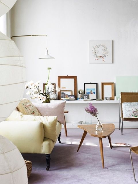
    Pastel Tones


    Having a carpet in cooler shades doesn’t have to mean choosing from the bland neutral colors. Carpet shops still have a great selection of coverings in softer pastel shades. These can give a room a sophisticated but low-key look, where other elements are allowed to shine. They offer a subtler finish than some of the other designs that are available. This year sees an increased use of chalky colors, in varying shades of greens, yellows, pinks and purples. These more subtle tones allows for modern styling and sophisticated furnishing.
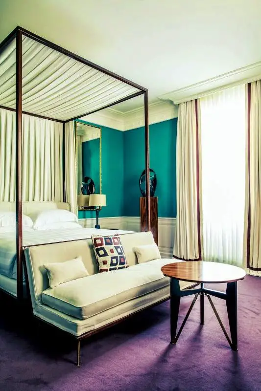
    Richer Hues

    via Pinterest via Travel & Leisure


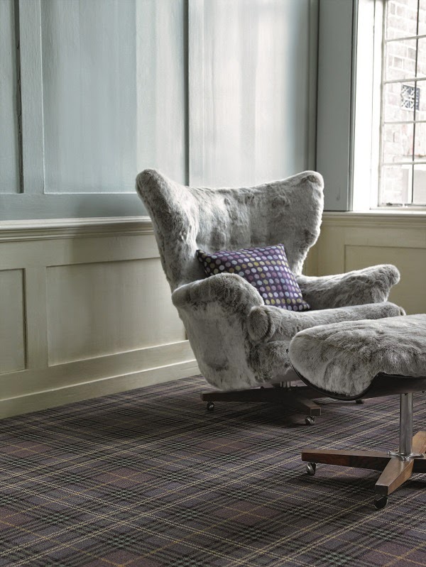
    If you want to create a feeling of luxury and elegance within a room, then you should choose from one of the richer carpet colors that are available. These dark colors, with variants of black, navy, grey and burgundy, will give the room a more dramatic finish as well as a warm and inviting atmosphere. They are the perfect choice for living and dining areas, and dark blues especially work well with metal and wood. By choosing a darker color for your carpet, you’re making it the key element of the room. In order to complete the look, you need to use minimalist furniture and decorations, so as not to take away from the effect of the carpet.
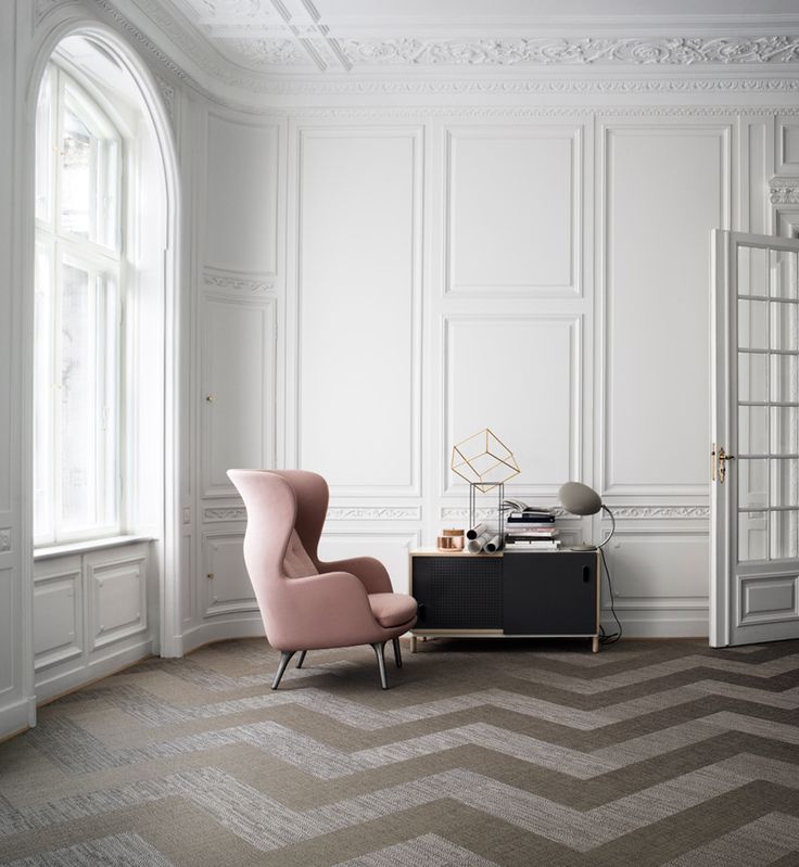
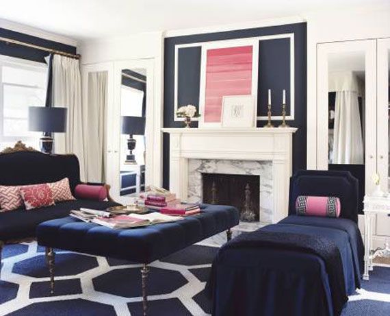
    Bold Graphics

    Love the different shade of Blues and white mixed together for a classy elegant look!
    via cimots


    Not everyone wants to use a carpet in just one color, and often a combination of two or more in a distinctive pattern can be the perfect finishing point for a room. This type of carpet is making a true style statement and is only for those who want their flooring to be the talking point for guests. 2014 sees a range of patterned designs come on to the market and often these have been combined with bold colors. This type of carpet works best in contemporary homes, where the furniture is clean and simple. Both large print checks and stripes are popular choices; striped carpets also have the effect of lengthening rooms.

    When you’re choosing your next carpet, it’s useful to look through a number of carpet shops to ensure you get the right one for your room. Take away some samples and see what works best with your interior design ideas and existing furniture. 

    Comfort Textures

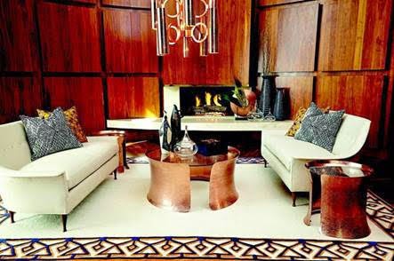
    The under-foot comfort that comes with a thick and luxurious carpet is undoubtedly worth paying the money for a quality carpet with underlay and perfect fitting. A plush carpet for the bedroom floor where there is a low level of traffic will be perfect for that warm and cozy feel. Over-sized loop piles and thick loop twists are at the forefront of luxury textures for a new trend in carpeting giving that quality under-foot feeling.