When it comes to interior design, colour trends come and go. In 2020, a few shades stand out as being particularly on-trend. Generally speaking, there’s a trend toward more muted pastel shades, with perhaps a single bold colour being present in a ‘feature’ wall, to provide a little bit of dynamism – though in smaller living spaces this is often overkill.
There are numerous ways to apply paint to walls, from rollers to brushes. To get a really even coat, it’s difficult to look past an air compressor. These devices turn your emulsion into a giant aerosol can, ensuring even coverage. For more information on this practice, check out this guide from SGS engineering.
But before you can start applying your colour, you need to choose it. So what are those five transformation colours?
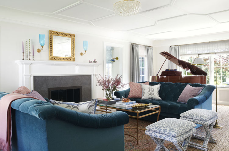
Purple

Loud and brash colours can provide the impact that a living space needs when you first walk into it. With that said, it can be overwhelming, so opt for a chalky pastel shade of it. You can create highlights in a purple room with the help of a few orange or yellow items of furniture, which will contrast very nicely. Purple is one of those colours that matches certain kinds of personality – so you might already know that you want it in your living room!
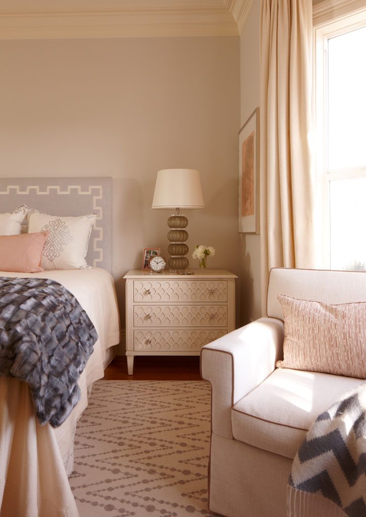
Beige

While many of us might claim to hate beige, there’s not really a great deal to complain about. It’s a fantastic ‘blank canvas’ colour that’ll let the dimensions of the room itself, and the items you fill it with, do the talking. What’s more, it’ll never go out of style, so it’s perfect for those who’re looking to put the paint away for the long-term afterwards.
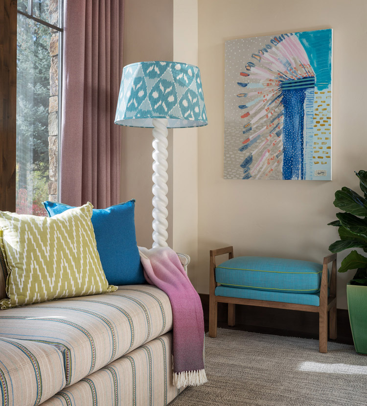
Teal

Darker shades will, contrary to popular opinion, help to disguise the fact that a room is small, rather than drawing attention to it – but only if you’ve got the lighting right. A deep shade of blue-green will lend that touch of vibrancy and class to your space, which you can offset with a few choice timber items and pieces of brightly-coloured furniture.
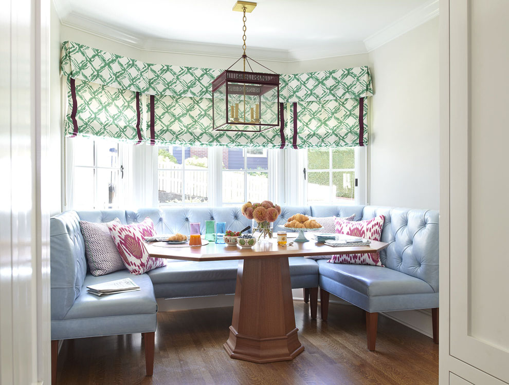
Green

A fuller shade of green is something that humans are biologically predisposed towards. Our eyes have adapted to find trees and vegetation pleasant to be around, and thus you can create a pleasant cosy atmosphere with the help of the right shades of green and brown. Go for something muted and soft, and contrast it with yellows, purples and browns. If you’ve got a hardwood floor, then green makes a naturally suitable complement.
Grey
Grey can be a bit sterile and dull if you’re not careful. But what it will do is provide contrast for those interesting pieces of furniture in your living space. Bring quality timber in, and you’ll find the eye naturally drawn to the grain, which is brilliant if it’s been treated appropriately. Go monochromatic and you won’t have to resort to especially garish, bright colours in order to draw the eye – which is fantastic if you’re going to be spending a lot of time in your compact living space. Thanks to SGS Engineering for collaborating!
Leave a Reply