I had a fun little project this weekend which was to compare Glidden’s new paint formula with a higher end paint. In this case they sent me Benjamin Moore to compare with their paint and both were a white eggshell base. I applied the paint directly on a wall in the dining room which is currently undergoing a little renovation, so it’s going to be painted over soon anyway.

 The package and it’s contents that Glidden sent me. The papers with the black stripe though the middle were special testing sheets, which I didn’t end up using since I had a wall available.
 Each can upon opening. This was the only place I saw a difference, was that with Glidden there was a layer of medium (a translucent layer) of liquid at the top, which I stirred in.
 This is the Benjamin Moore swatch. It went on really well and with good coverage. It was a little thicker than Glidden and didn’t splatter.
 I used a fresh brush and applied the Glidden swatch. It had a slightly thinner consistency and didn’t splatter either.
 Glidden on the left, Benjamin Moore on the right.
All in all, and days after, I really cannot detect any difference between the swatches. I was really impressed with the one coat coverage that both paints provided. As far as wear over time I won’t beable to comment, but as of right now I can honestly say that I think performance is equal.
Now, for the really fun part! Like I mentioned the dining room is going through a little renovation, and will need to be painted. Below you will find the fabric my mom wants to use to make valances and curtains for the room.
There’s been some questions about the house so here’s some clarification: This is my parent’s house. It is a 65 acre farm in MD. The house is very country. The ceilings have salvaged beams, some of the walls have dark wood paneling, and there are wood burning fireplaces throughout. The fabric wouldn’t be appropriate in modern houses I agree, but it fits my mother (this is a lady who spends weekends baking bread!), as well as the country feel of her rancher.
 I’ve tried to get the true color as close as possible. She wants to use the fabric as a jumping off point, and mom is leaning toward painting the room a warm, brickish red without too much pink in it, as seen on some of the flowers in the print. However, she is very open to some other suggestions too!
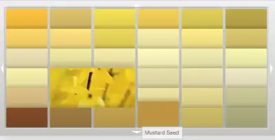
Here are the glidden swatches:
I’ve randomly assigned each one a letter and I also randomly rolled over one of the colors on the Glidden site to get the color name. Here is the link if you’d like to give me a color’s name. Or, you could just say something like, Palette C., 3rd row, second column – the pale tanish color. (just fyi, rows are horizontal, or across, and columns are vertical)
I really look forward to hearing your suggestions and I hope you’ll respond!
A.
B.
C.
D.
E.
F.
G.
H.
I.
J.
K.
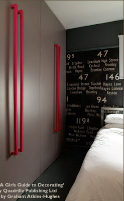


 Love the hot pink accents!
 This is a sketch of the living room above from the book which is accompanied with tips for furniture, texture, etc.
 I just got a suede handbag very close to the color of those cabinets – so pretty!
 I adore this home office! So bright, and alive but still serene.


 In the woods beside the back fields.
 This is to the side/front of the house
 A tree my dad keeps asking me to do a drawing of for him – a shag bark hickory
 Remember when
  Another view out the front
 some little deer, wondering why my parents are up so early
 Another view out the back
 I think I’d have to add this sweater..
 …but I also

 oohhh..


 I need this one too I think
 So – what would you put on your Christmas list?
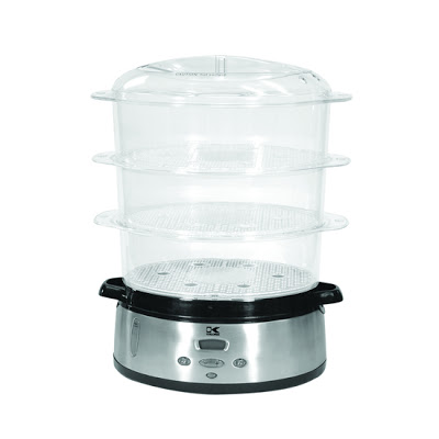

 Love the look of this tea maker – they also have espresso and coffee makers at the sale.
 this steamer’s $33!
 This teapot is chic and adorable. The ability to keep warm with a tea light is great too!
 Here’s another one – this sofa seems so intuitive, yet I’ve yet to see this before. My only qualm is it’s a little too modern for my tastes. Or I’d atleast like the option for the couch to be the same dark color as the table/ottoman slideout so it blends in when the whole thing is compacted.
 It’s hard to know how sturdy this is – but it’s a great idea!

 oh that bed…that vanity…
 I really like the clear to black candlesticks


 I wear this same outfit when I have to go to the post office


 I think this is so pretty and sweet. It’s a similar idea to that above – but instead of painting the chimney breast it’s been wallpapered.
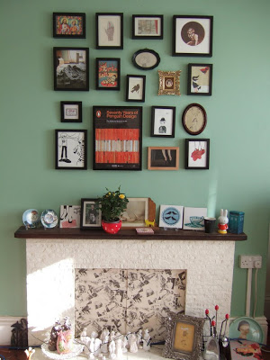
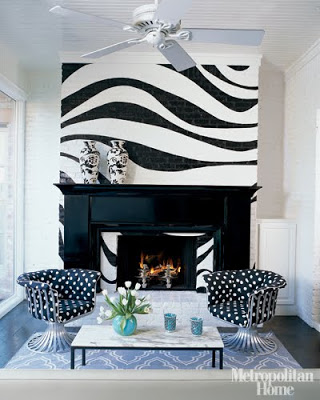
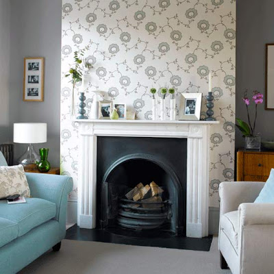
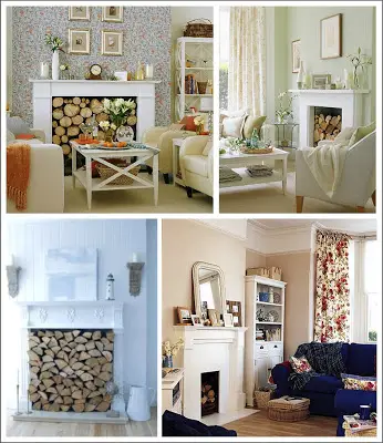 All four of these images make me gush – and a great way to use a fireplace that is non-working or out of season.
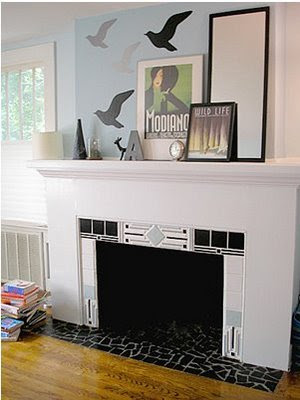
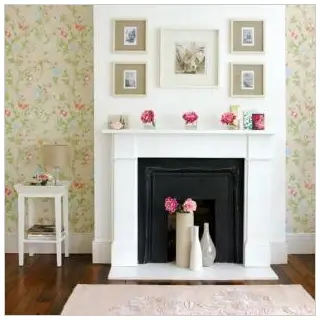
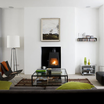 I think the magic of the image above is that the painting above the fireplace is almost the same size and proportion as the fireplace opening. The stark white walls also make a striking contrast.
 via
via