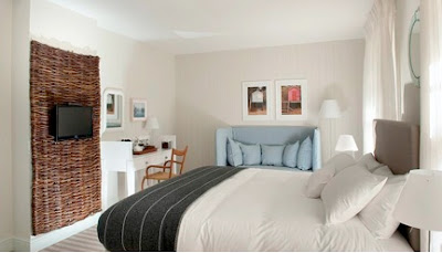
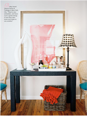
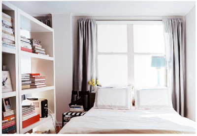
Now enter sister Victoria’s apartment. As you can tell, she’s very influenced by the glamor of the 50s and 60s, but with a clean traditional feel as well. I really like her color palettes.
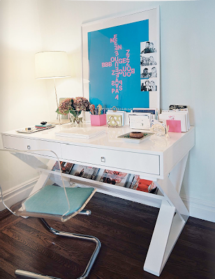
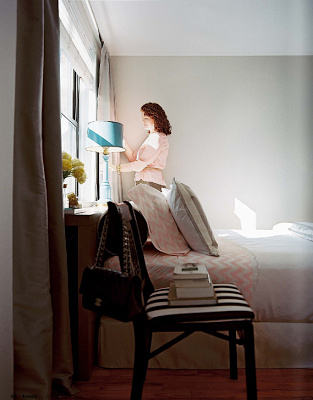
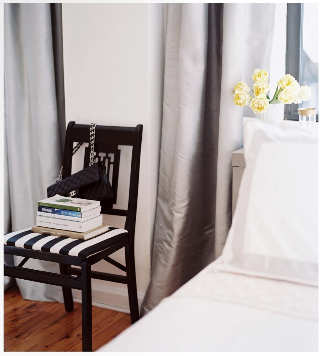
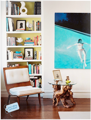 love the chair
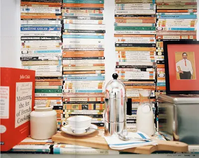
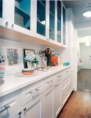 a gorgeous renovation for this small but great kitchen
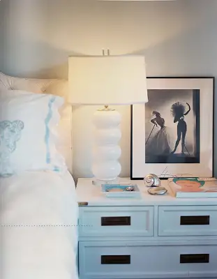
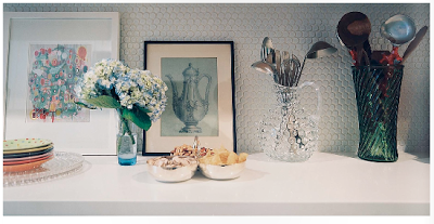
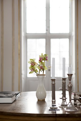
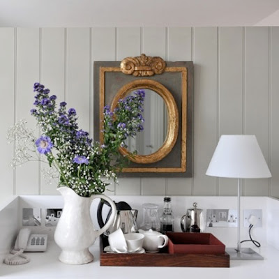
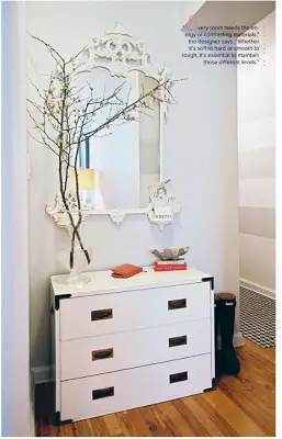
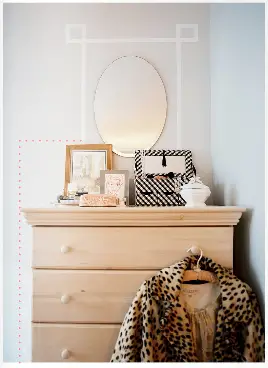
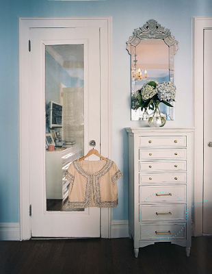 This shot is so pretty – the narrow drawers and the hydrangea and mirror.
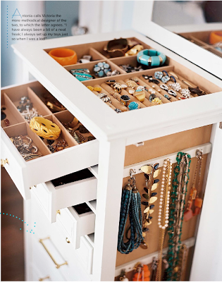
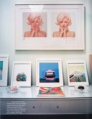
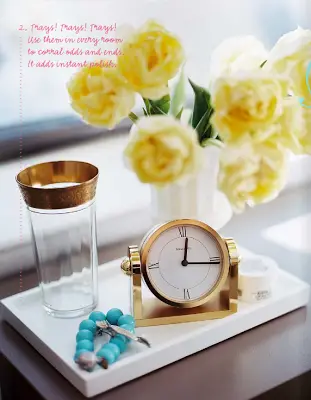
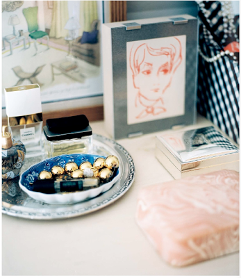
 It’s all so pretty!
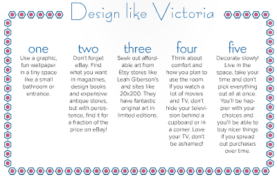
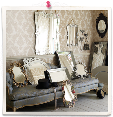
 Click the image above to read Victoria’s design tips…
via Lonny Magazine
 these are tooooo pretty!
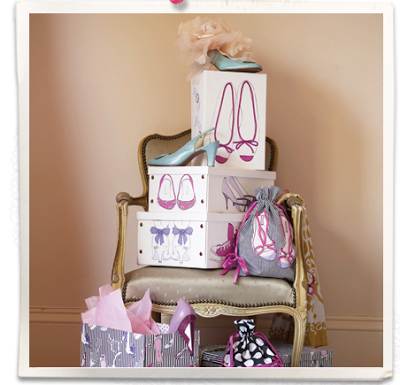
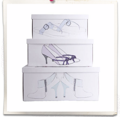 really cute shoe boxes
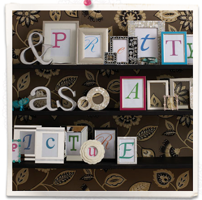
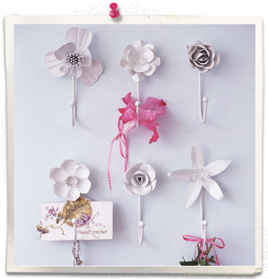
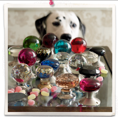 pretty glass knobs
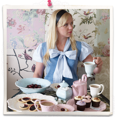 vintage tea accessories!
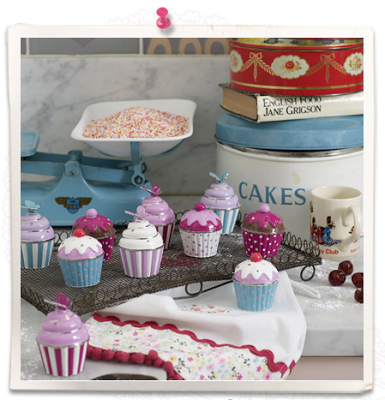 adorable cupcake shaped trinket boxes
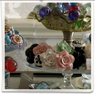
 love the flower drawer pulls!
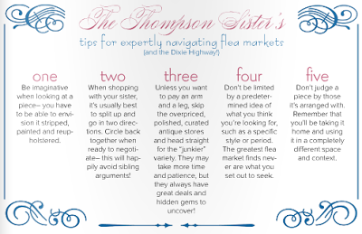


 I really want a tiny set of library steps like these – does anyone know if/what there formal name is?


 This paper is just gorgeous


 so pretty…


 Read and see more at my guest post on
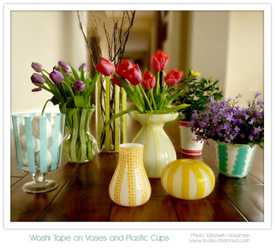


 Some of these vases she’s created are actually paper cups!
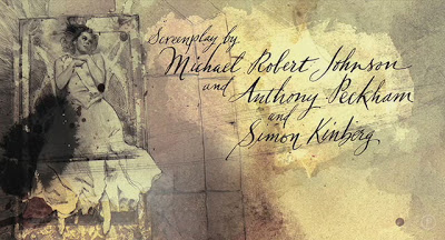
 The board


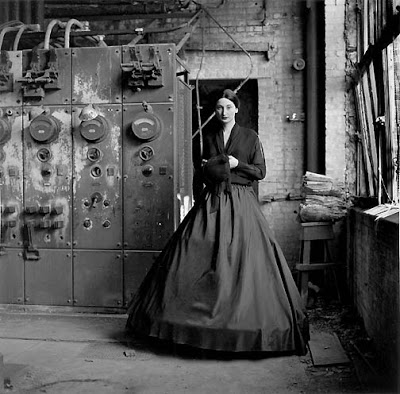
 Rachel McAdams was great in this role too – but I like all her stuff (a bit of a girl crush)


 So, if you ever watch the movie stay tooned for the great work of art that is the end credits!
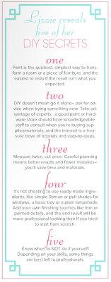
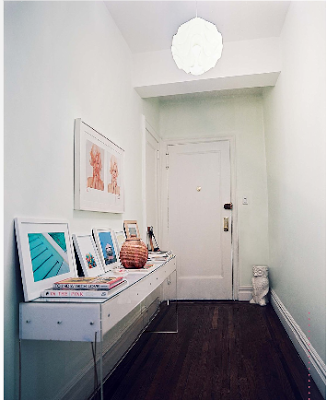
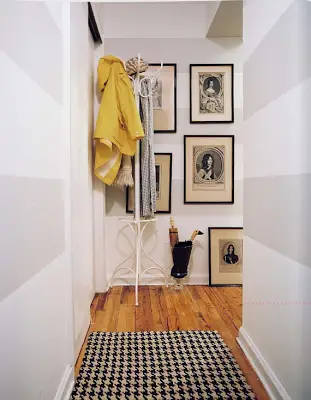 The horizontal stripes in the entry way is just great. A smaller space is a great place to go bold if there’s a certain wallpaper or paint treatment you love but are too nervous to use in a large room. It helps create little nooks of interest.
 Click on the image for a larger version of Lizzie’s DIY secrets
 Wasn’t that serene?
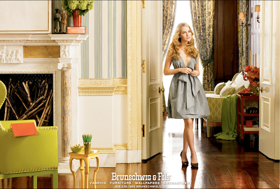
