It’s easy to make design mistakes in your living room since this is among the busiest spaces in a home. Most people have the best intentions when decorating a living room while maintaining a good flow. While balancing practicality, functionality, and aesthetics can be tricky, getting the aspects right can make your living room feel inviting and luxurious. Here are some common design mistakes to avoid when sprucing your space.
1. Choosing Small Rugs and Random Throw pillows

Some people often choose smaller area rugs that don’t match the room. This mistake makes your living room look smaller. Instead, ensure the rug is wide enough to accommodate at least two sofa legs, but it should fit all the legs when possible. However, layering rugs can work when using small rugs on a large floor.
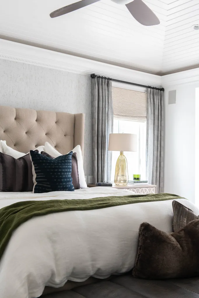
Choosing the perfect throw pillows for your couch can be tricky, and most people often make the wrong choices. Ideally, throw pillows should match the sofa by contrasting the pattern or colors on your couch. Most importantly, the texture should contrast and highlight the unique features of your upholstery. Similarly, using too many pillows can be uncomfortable. Any sofa size works well with four pillows; two pieces tucked behind two front pillows.
2. Using Wall Art That Doesn’t Match the Color Scheme
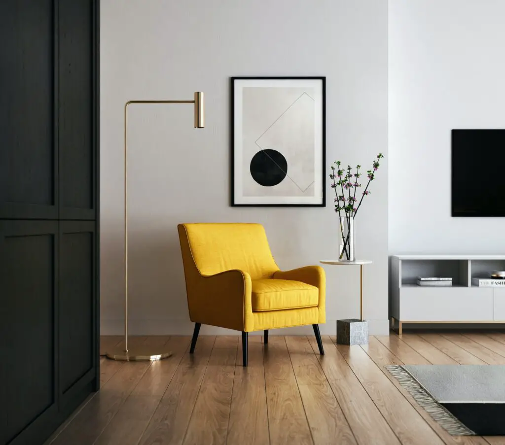
Your living room wall art depends on your taste, but it plays a crucial role in unifying the space. The art should share the color scheme in the living room. Consider the furniture, couch, and rugs to ensure your art complements the key décor pieces, making your space feel calm and unified.
Height placement is as essential as choosing the perfect spot to hang the art. Most people hang the art too high on the wall. Instead, position the pieces at eye level. If you are hanging wall art above your furniture, leave a space between the furniture and the art pieces to give your living room a cohesive touch.
3. Installing the Wrong Drapery

A good living room window treatment can significantly elevate the space, but unintended mishaps make the room feel smaller and disorganized. Perfect curtain rod placement is among the trickiest parts of window treatment and can confuse experienced DIYers. The process involves different considerations and measurements depending on ceiling height and window design. However, you can adapt the process to any style if you master the basics.
Your ceiling height depends on the roofing style and workmanship during installation. Involving Utah commercial roof repair professionals is critical to ensure a great outcome. Ideally, you should place the rod a few inches above the windows, but the pole should be higher to create a sense of height and make the room appear spacious. The curtain rod should extend beyond the window trim to maximize the view and natural light when curtains are stacked away.
Endnote
There is no universal formula that instantly transforms your living room into a luxurious, functional, and eye-catching space. Achieving a luxurious interior design depends on your home’s style and color scheme. It’s critical to avoid some common flaws and ensure your home feels connected, comfortable, and practical.
Thanks to all the companies linked above.

Leave a Reply