I get a lot of requests from readers trying to discover “their style” when it comes to interior decorating. There could literally be, and probably are, books written on the subject, so this post will only cover one part of “style.” That part is a paramount one however – color.
Color can create the mood of a room like no other decorating element, which is why it’s such a matter of anxiety for homeowners and decorators alike. Well, I think I’ve found a quiz that is exceptionally thorough and thoughtful in determining your color style – it was amazingly accurate in it’s choice of mine! The quiz is from PPG Pittsburgh Paint’s Voice of Color, and called the “Color Sense Game.” It’s good to nail down your true color style because undoubtedly trends will come along that might tempt you, but in the long run it might be more cost/time efficient to choose a palette that you will always like.
Here are just a few of the questions –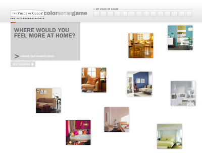 Choosing your ideal image of “home”
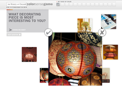 Choose your fav decorating accessory
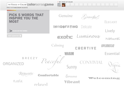 Choose words that are inspiring
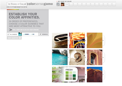 Your color affinities
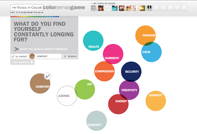 Your desires from a space
There are even song clips you listen to and choose the one that you like best – it’s pretty cool.
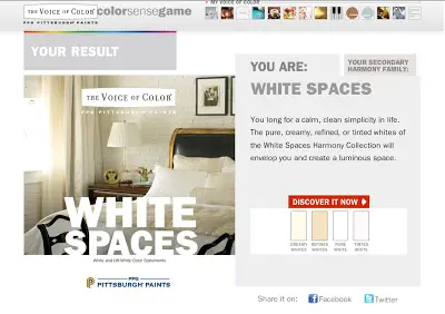
Can anyone guess the palette the quiz choose for me? If you guessed white, you’re right! Through and through I am drawn to white interiors. Here is there description of the “white” environment.
“Pure, clean white is ideal in a room with great light and lots of windows. Suitable for southern climates and ocean views, it is often cool or blue-white, and it has the most reflective power.”
 Some of my favorite white spaces:
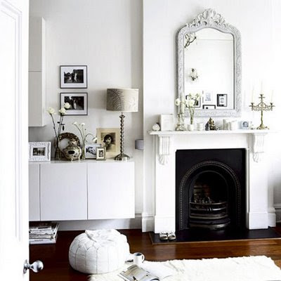 via Kitchen Details and Design
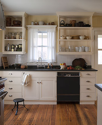 via Ochs Design
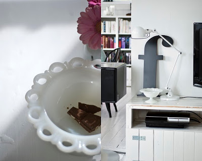 via Fjeldborg
They also give you a secondary palette, which for me was also spot-on – “Water Beads.” Which is comprised of blues. There description is, “The soothing colors of the Water Beads Harmony Collection suit any room where creating calm is essential. In the bathroom, the ocean hues suggest a fresh morning breeze; in layered pastels, they bathe generations of newborns in a soft, protective shell. Because of the serenity it creates, try blue in a screened-in porch, solarium or even your home office. Pair it with stimulating yellows or oranges to balance the relaxing effect.“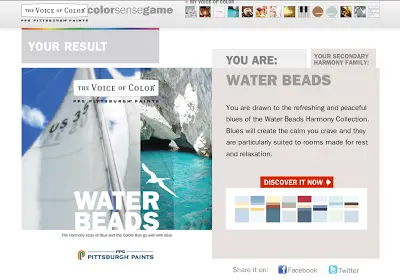 Some of my favorite blue inspirations –
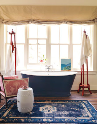 via House Beautiful
 via Elle Decor
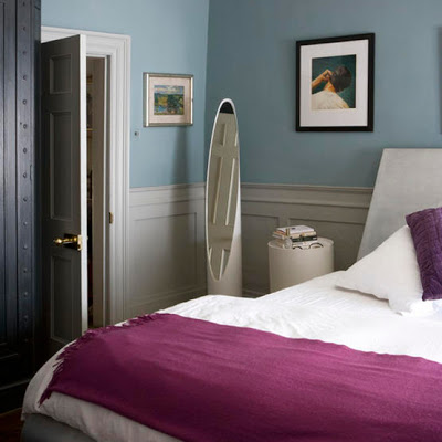 via LivingEtc.
I’m always trying to achieve ultimate serenity and relaxation in my space, so the quiz’s results were very accurate. Give it a try at the Voice of Color site. Leave a comment and let me know what your results were!
Leave a Reply