Inspiration by room
House Tours
Small Spaces
Tutorials and DIY
Lifestyle
Columns
Search
Decorology
Contact
About
e-Design
Website Design
Links
Terms of Use
Privacy
DMCA Policy
Bloglovin'
LOG IN
Welcome! Log into your account
Forgot your password?
Recover your password
Inspiration by room
Most Popular
v
See All >
Living Room
Kitchen
Bedroom
Bathroom
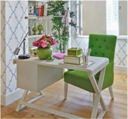
Home Office
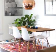
Dining Room
House Tours
Style Spotlight: How to achieve a modern Victorian interior style
Creating the Perfect Airbnb Retreat: Interior Design Tips and Tricks
A look back at my tiny kitchen 10 years ago!
Furnishing a small apartment, here’s what you need to know
5 Reasons Why You Should Hire Professional House Cleaning Services
Small Spaces
Basic Things to Consider When Hiring A Domestic Electrician in Inner…
Deciding On the Best Rental Property for Your Needs
6 Ways to Decorate Your Home With Flowers
Cozy and Pretty Eat in Kitchens
Diamond Painting – Square vs Round Diamond
Tutorials and DIY
Create The Perfect Cozy Nook
Everything You Need To Know About Painted Furniture Peeling: Problems and…
Spring is on it’s way! 10 great tips to freshen up…
A look back at my tiny kitchen 10 years ago!
The ultimate garage organization checklist
Lifestyle
Columns
renovation
Random
Latest
Featured posts
Most popular
7 days popular
By review score
Random
How To: Updating Your Old Wood Ceiling Beams
July 28, 2023
0
A fantastic surprise home makeover for a soldier returned from Afghanistan!
January 31, 2013
1
Fixer Upper: Small Town Charm
September 27, 2017
0
Gorgeous farmhouse modern in Chicago
April 8, 2011
0
New York City townhouse modern design and traditional bones
February 14, 2017
0
Ali Cayne’s light-filled family friendly NYC townhouse
August 22, 2016
0
Must see- the mother of all DIY, an abandoned French Chateau...
January 8, 2015
0
A Newly Renovated Farmhouse, Lidham Hill Farm
March 18, 2016
0
We are with Belgium
March 24, 2016
0
1
2
Page 2 of 2