A pretty and polished home from Studio McGee
This house is pretty darn close to my dream house. The large windows that pour in natural light, the molding, the palette in neutral cool tones with pops of color here and there. …sigh….


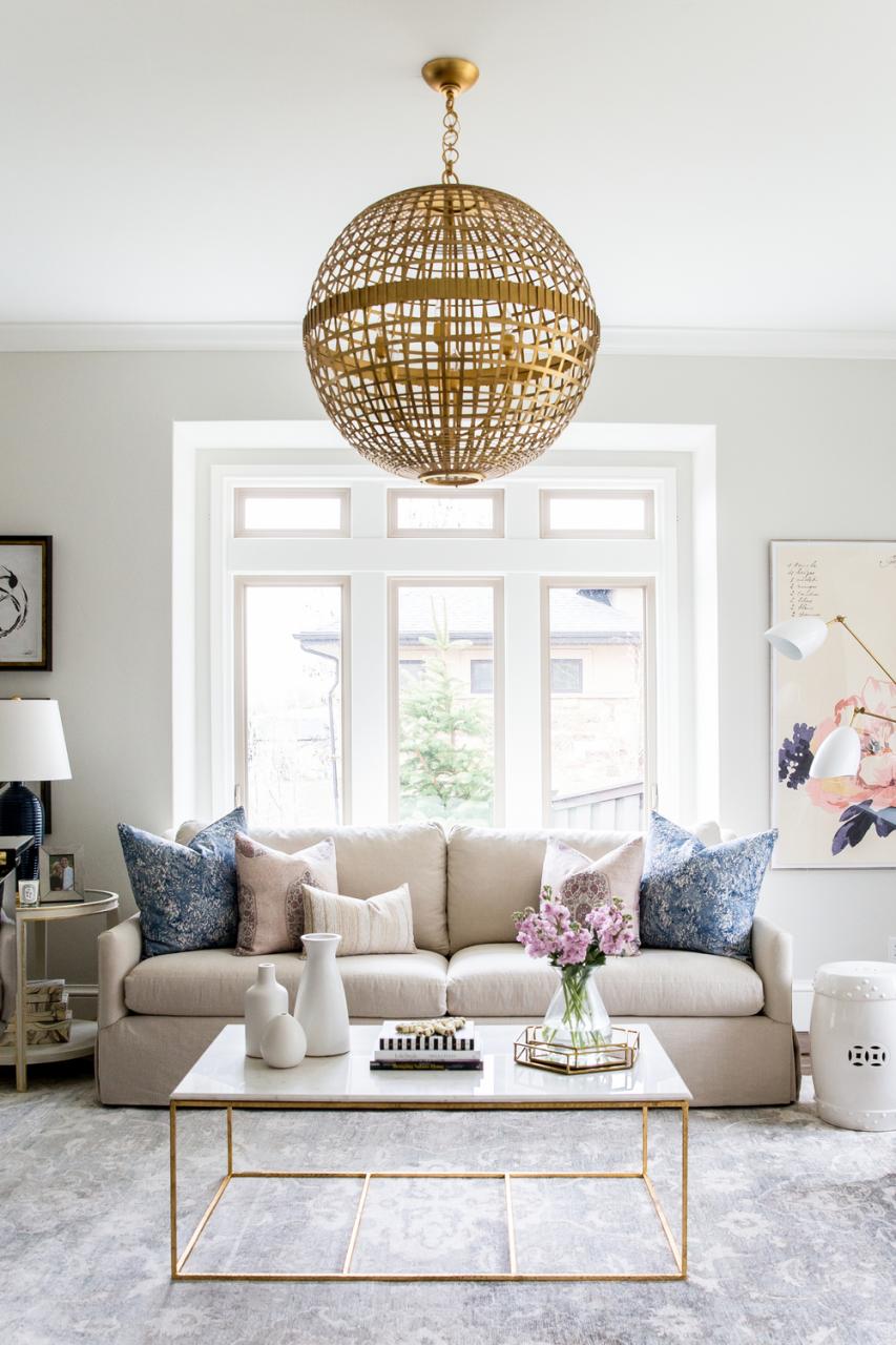
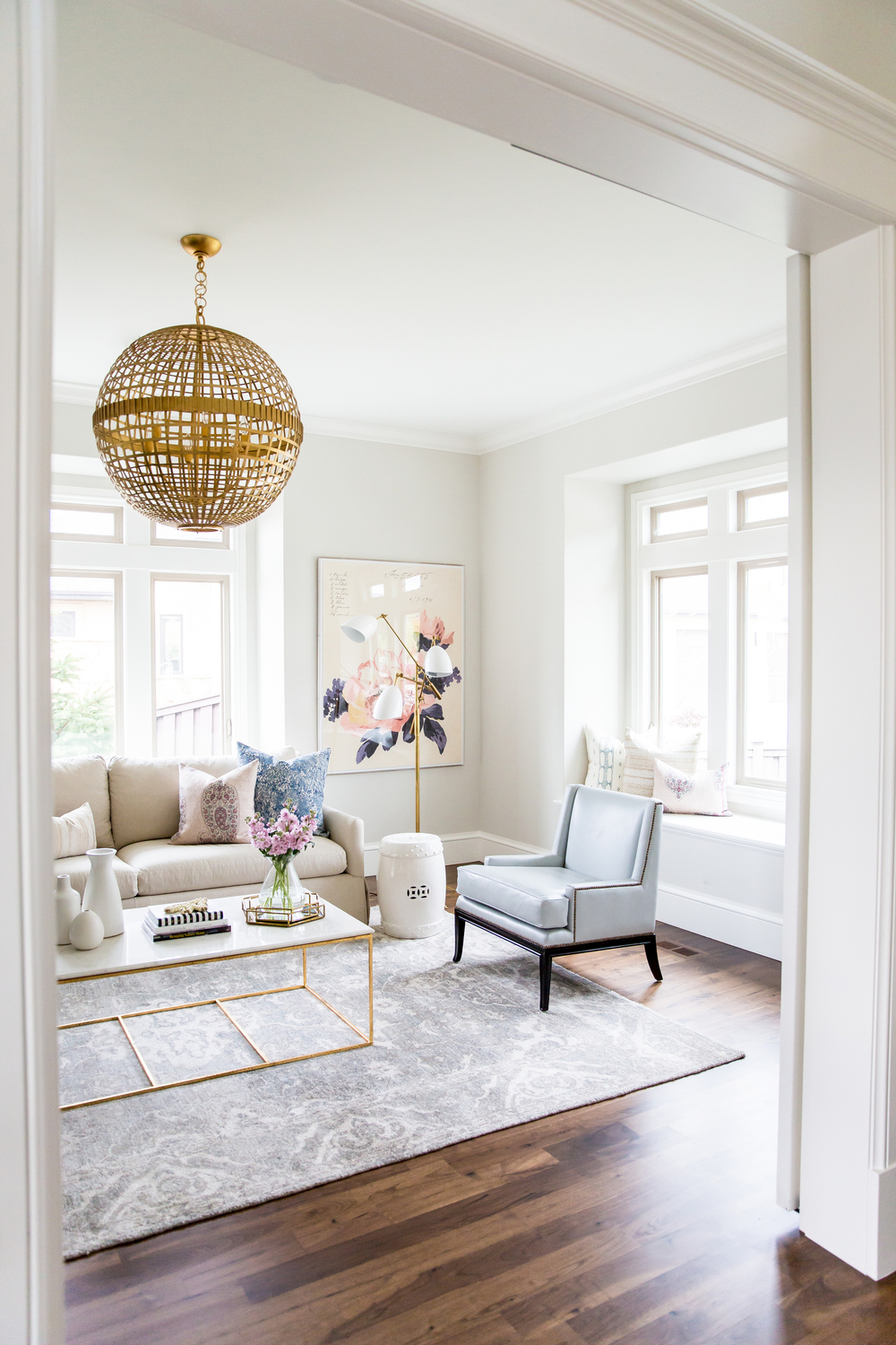
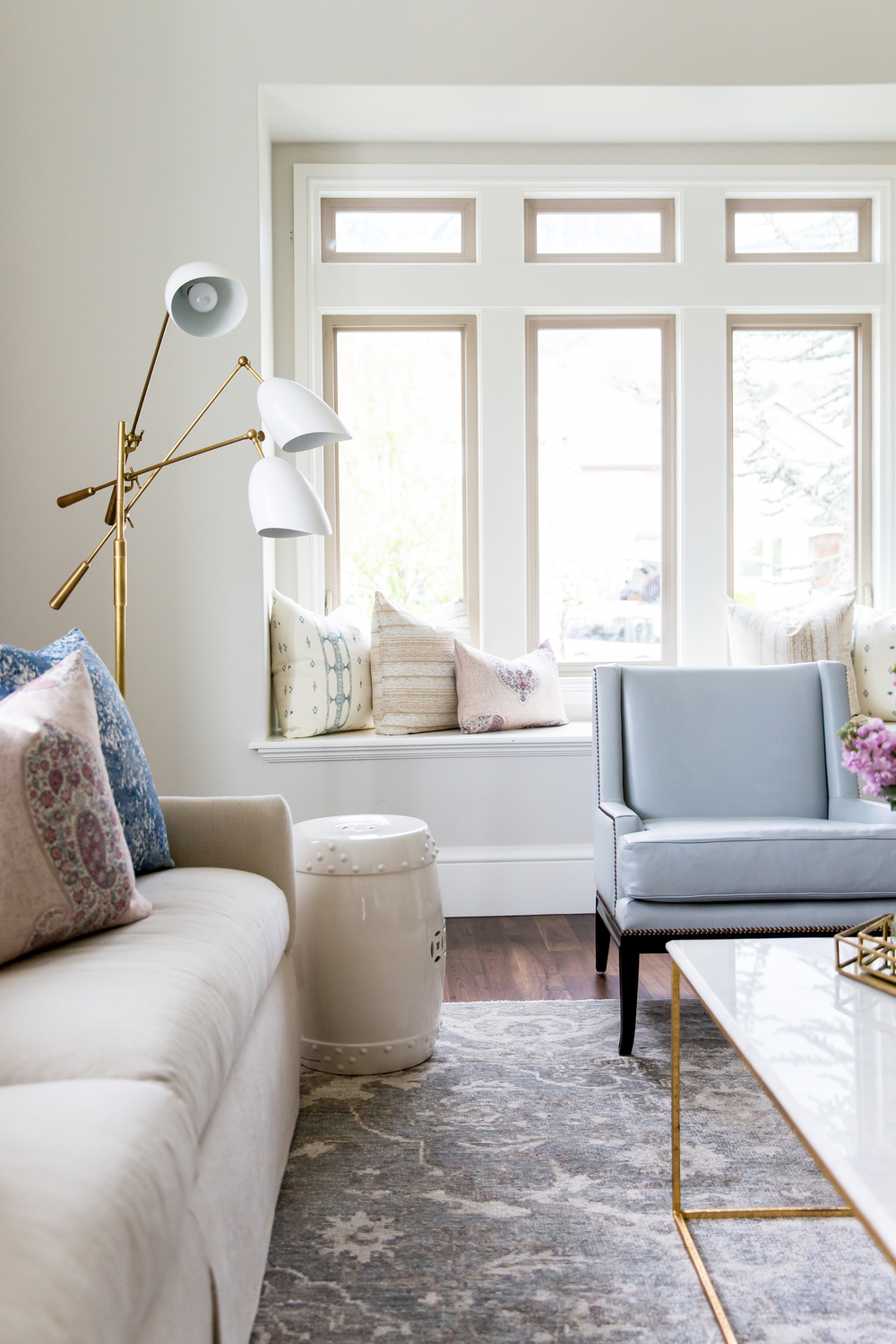
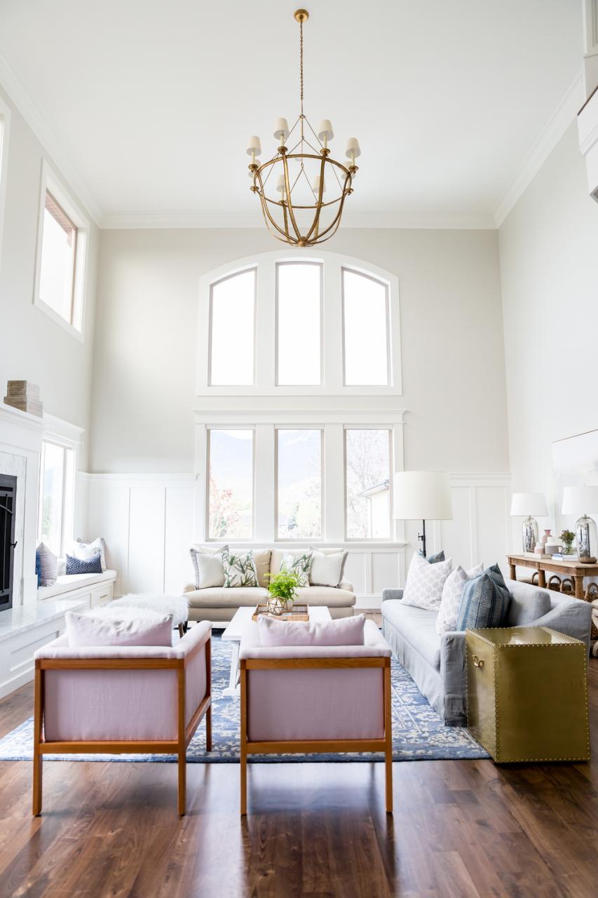
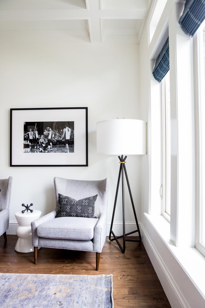
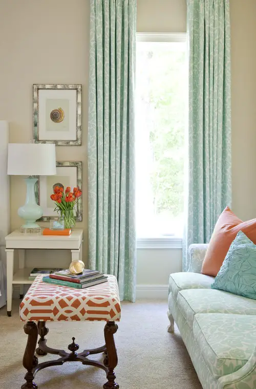
The three images above show the formal living room.

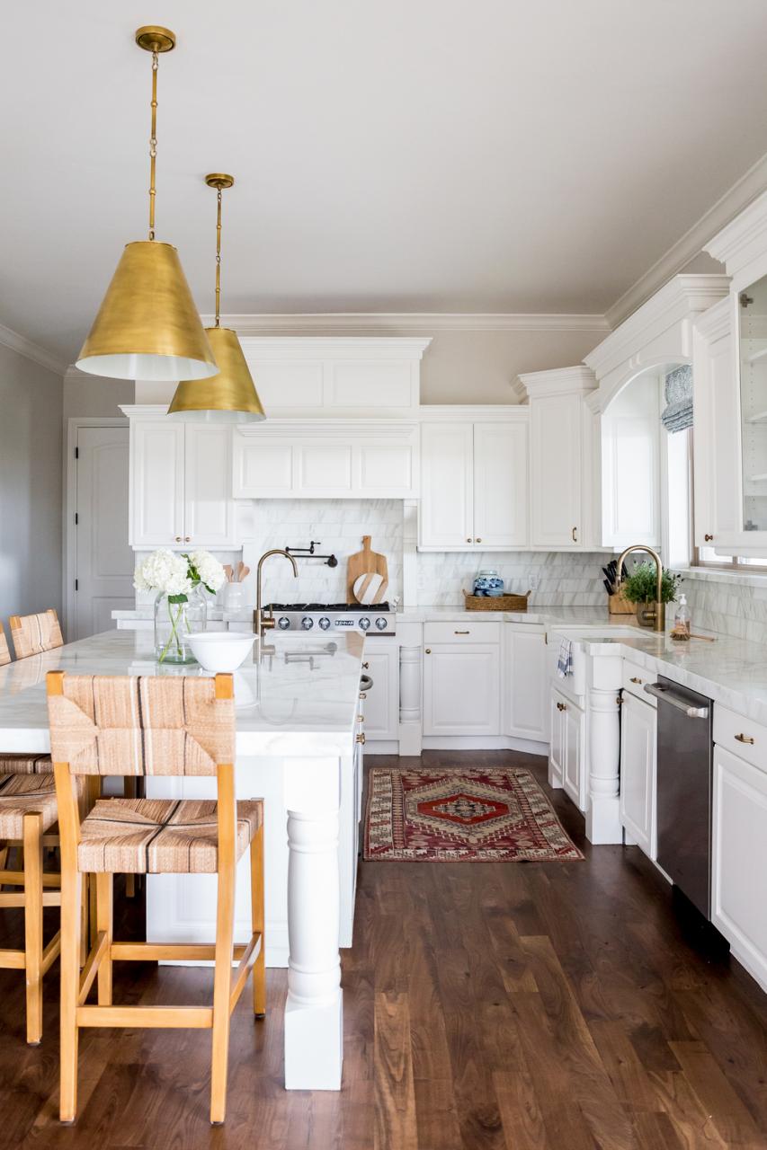
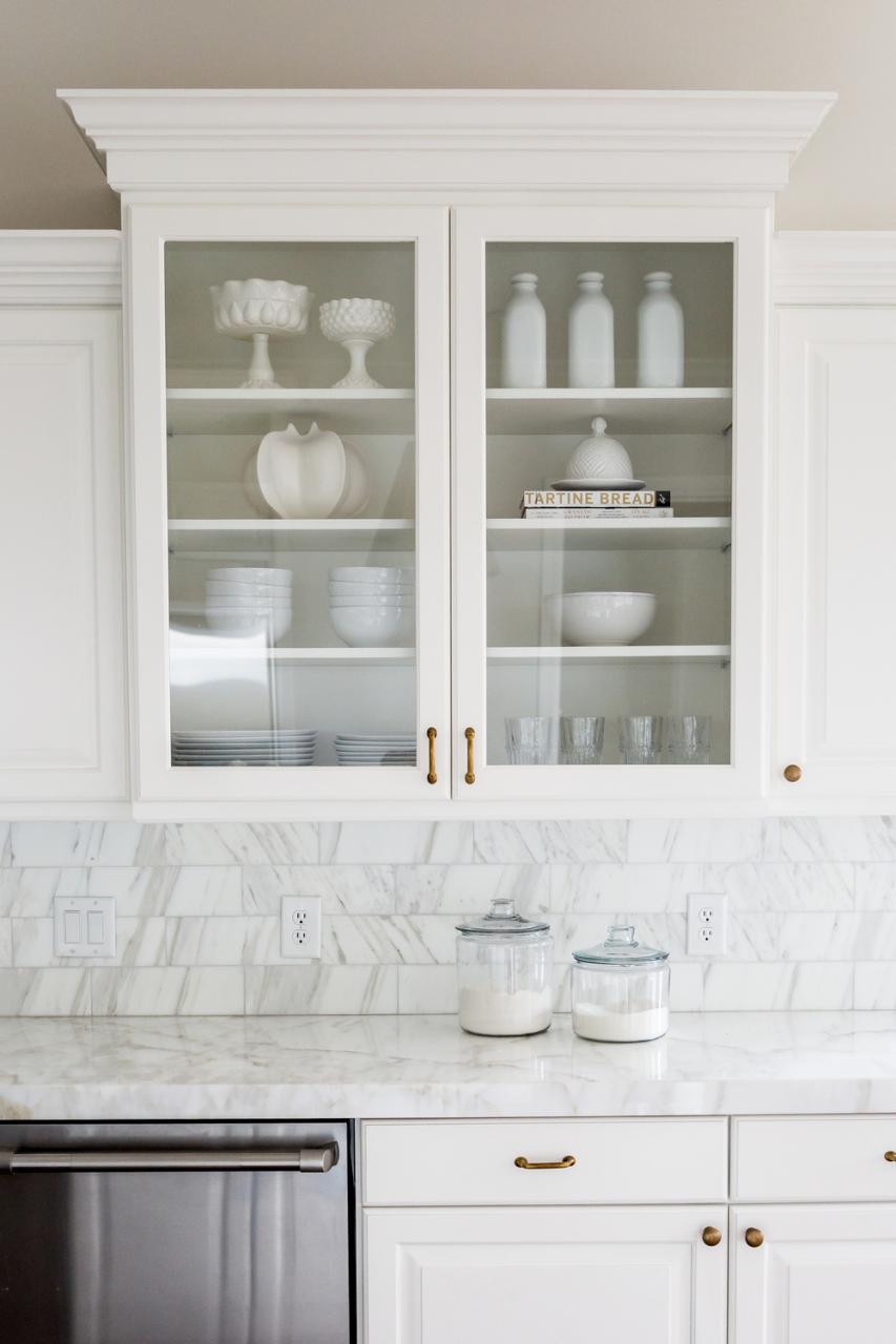
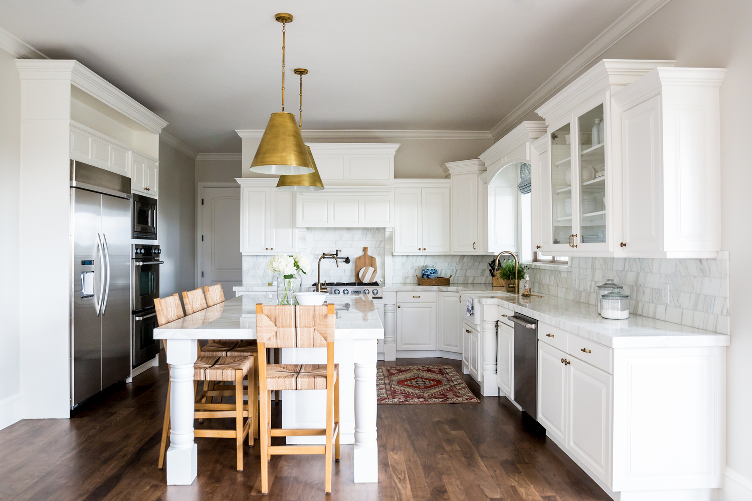
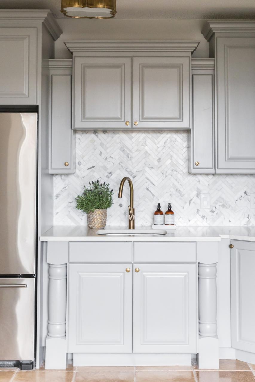
The kitchen and kitchen nook feature white and gray cabinetry and gorgeous marble backsplashes.
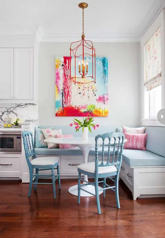
This is the kitchen nook. That herringbone backsplash is so beautiful.


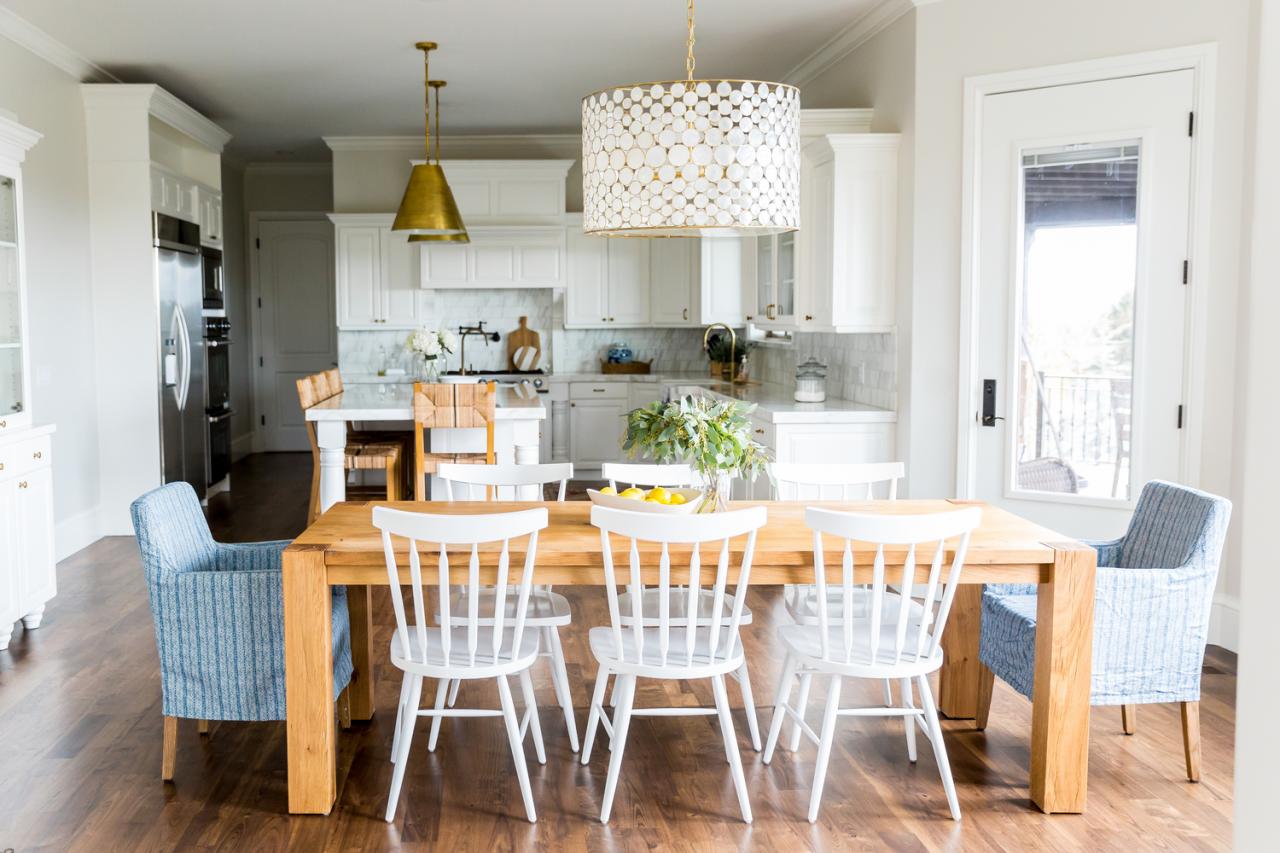
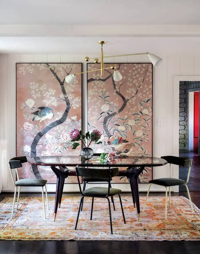
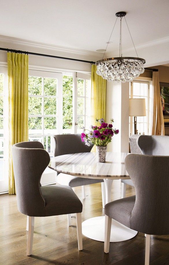
I like the mix and match chairs in the dining area. I’m not always a fan but I like it here.
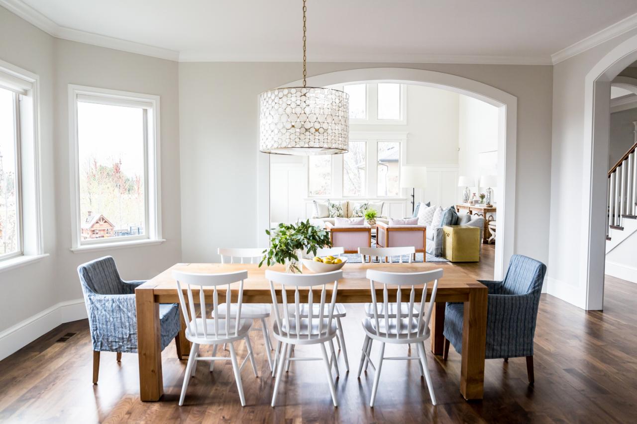
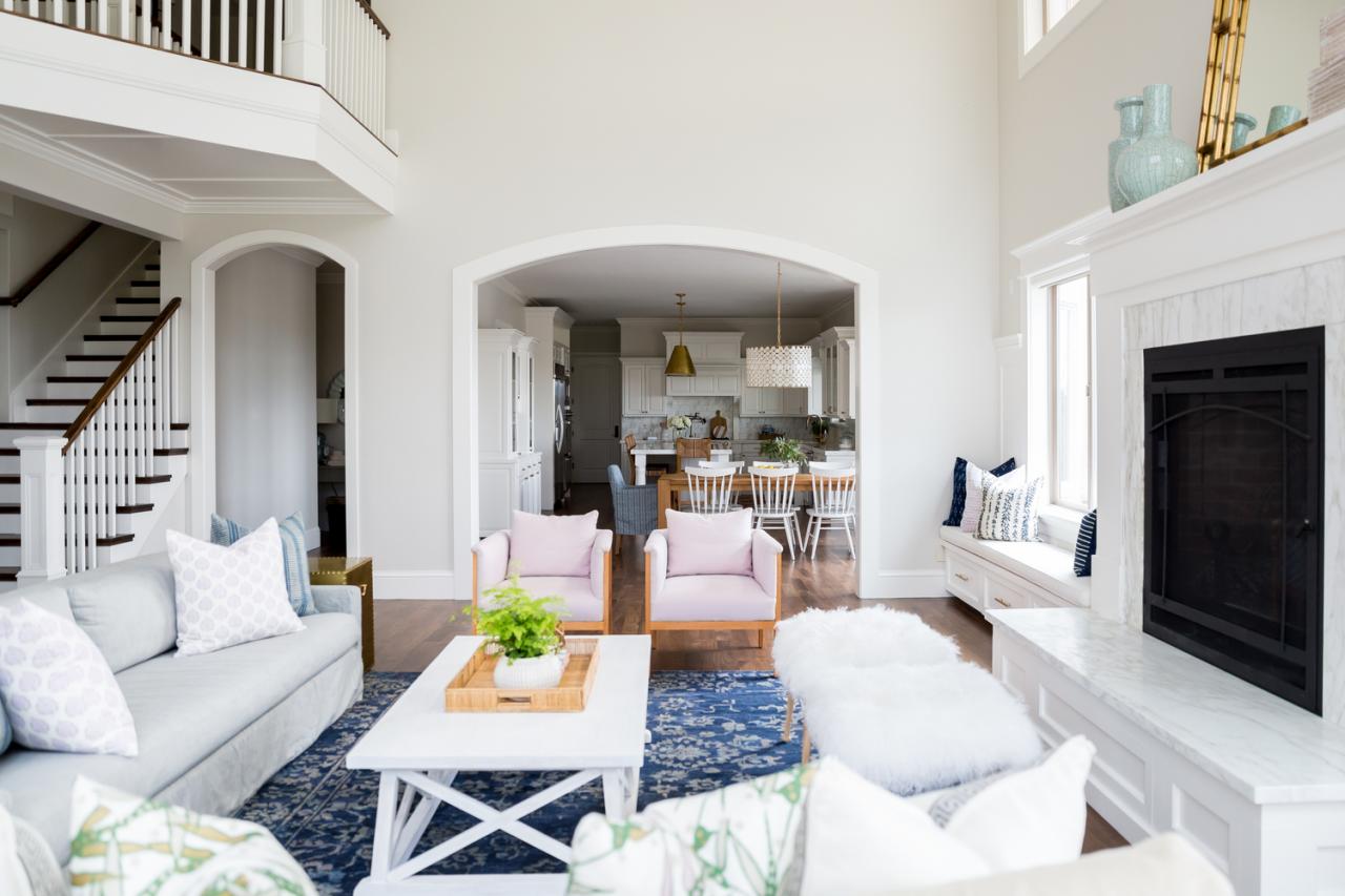
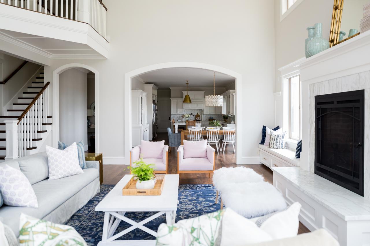
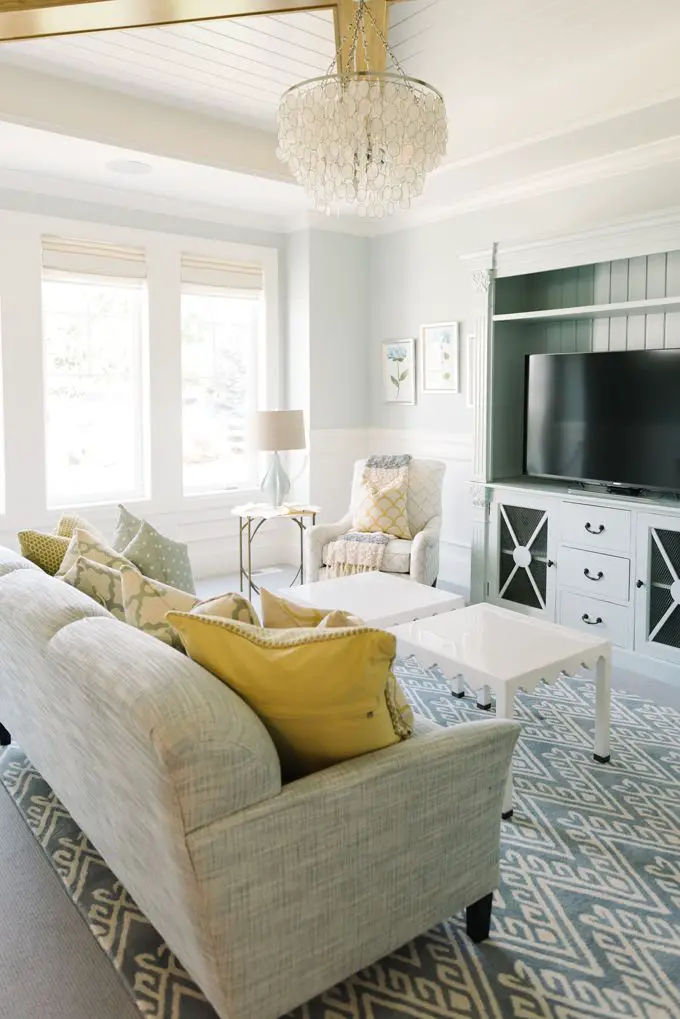
The dining room opens up into the beautiful great room.
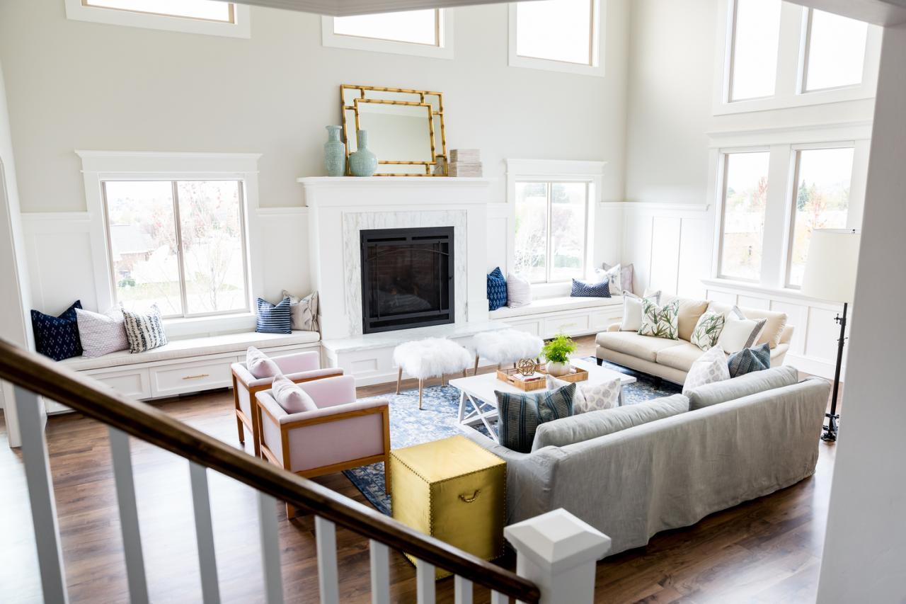
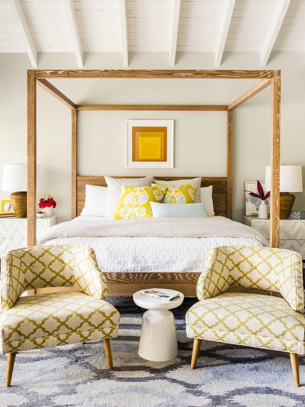
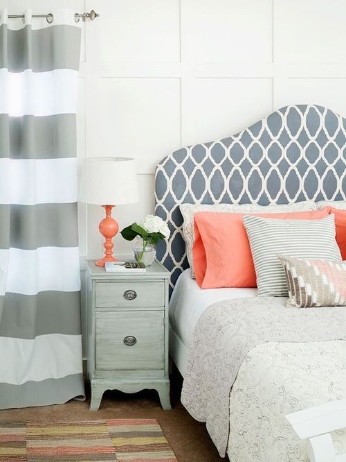
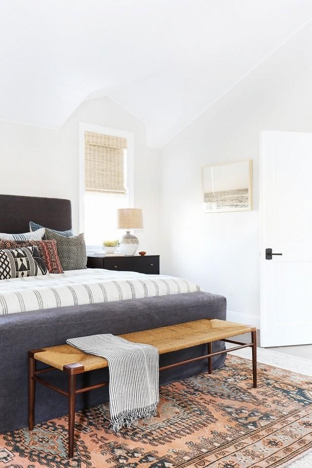
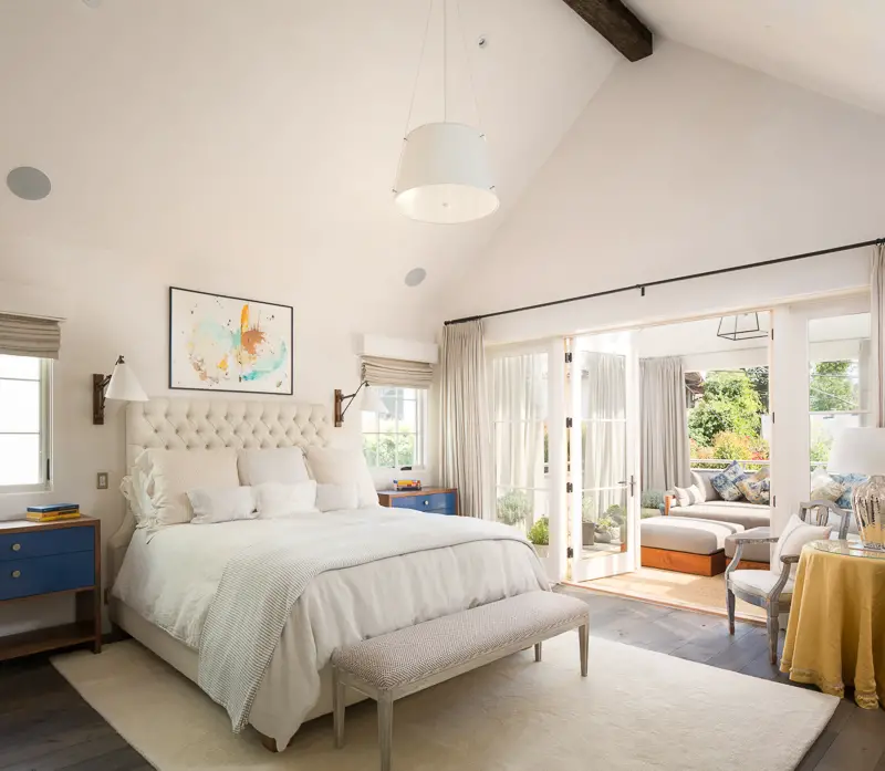
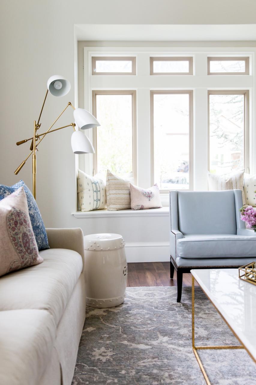
I really, really like the clean lines of the furniture used throughout the entire home.
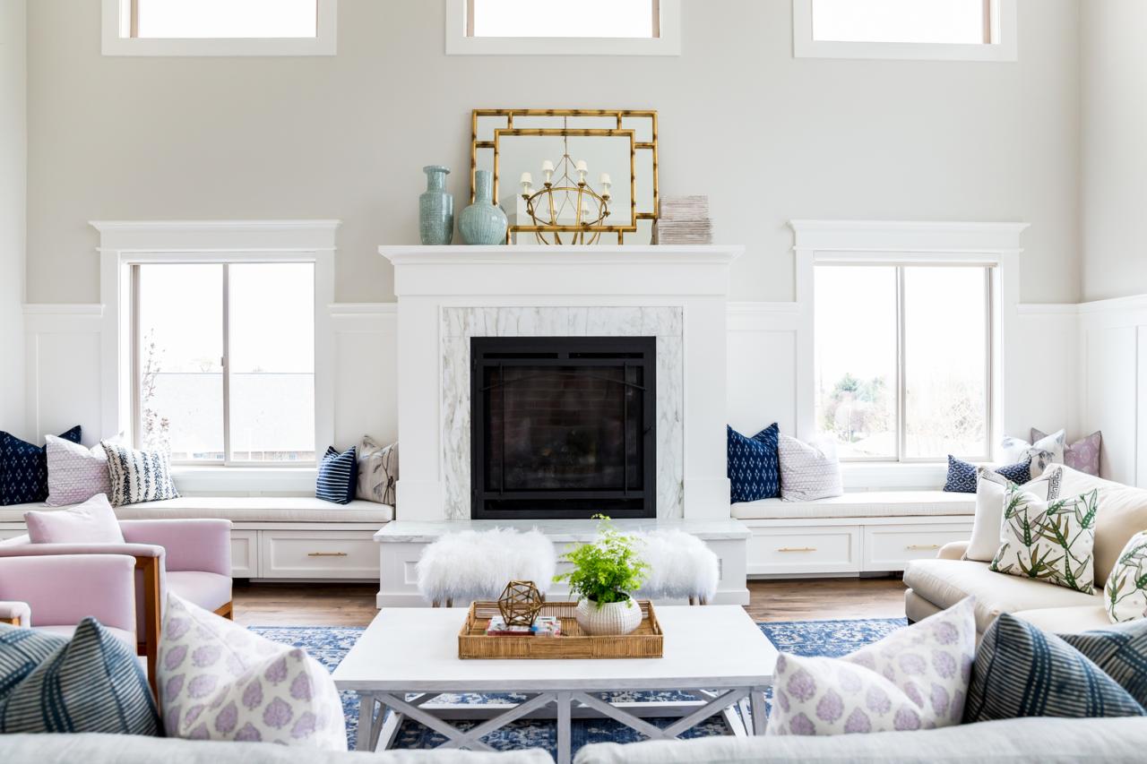
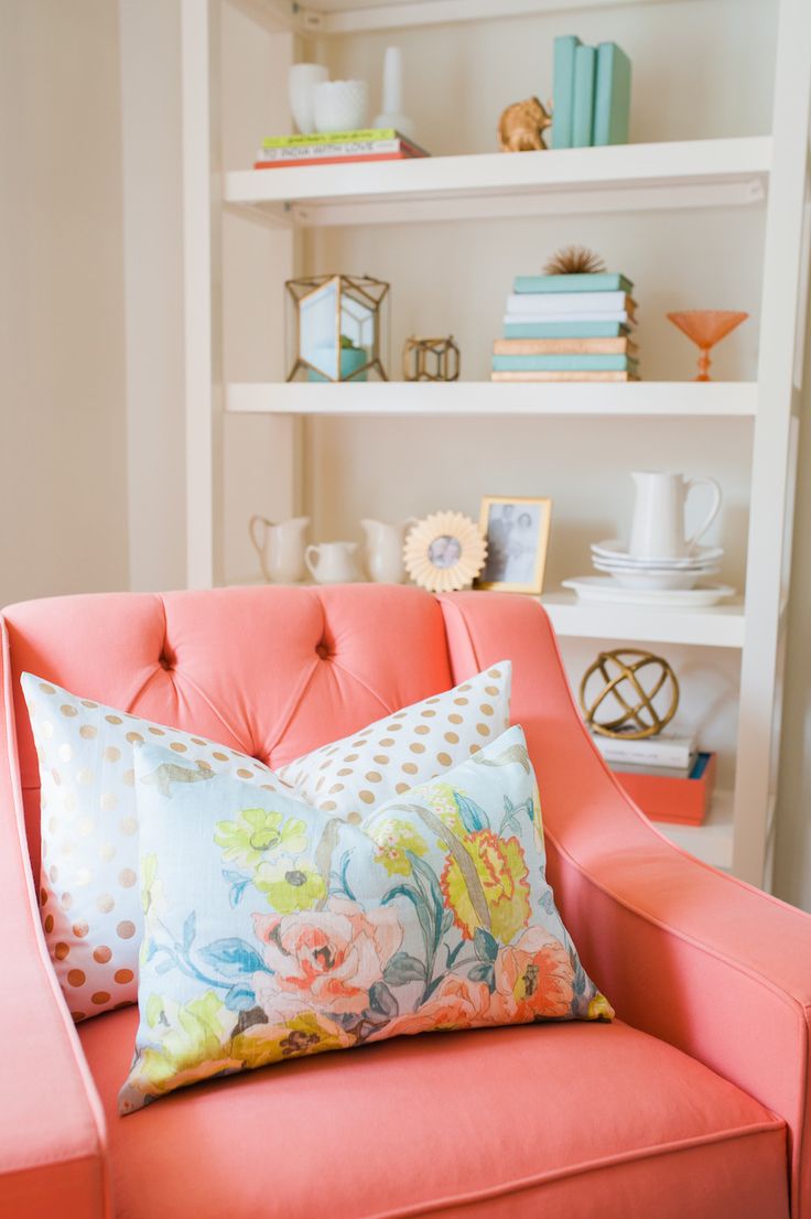
Lots of beautiful decorative pillows add softness to those clean lines a

The color palette is so pretty!
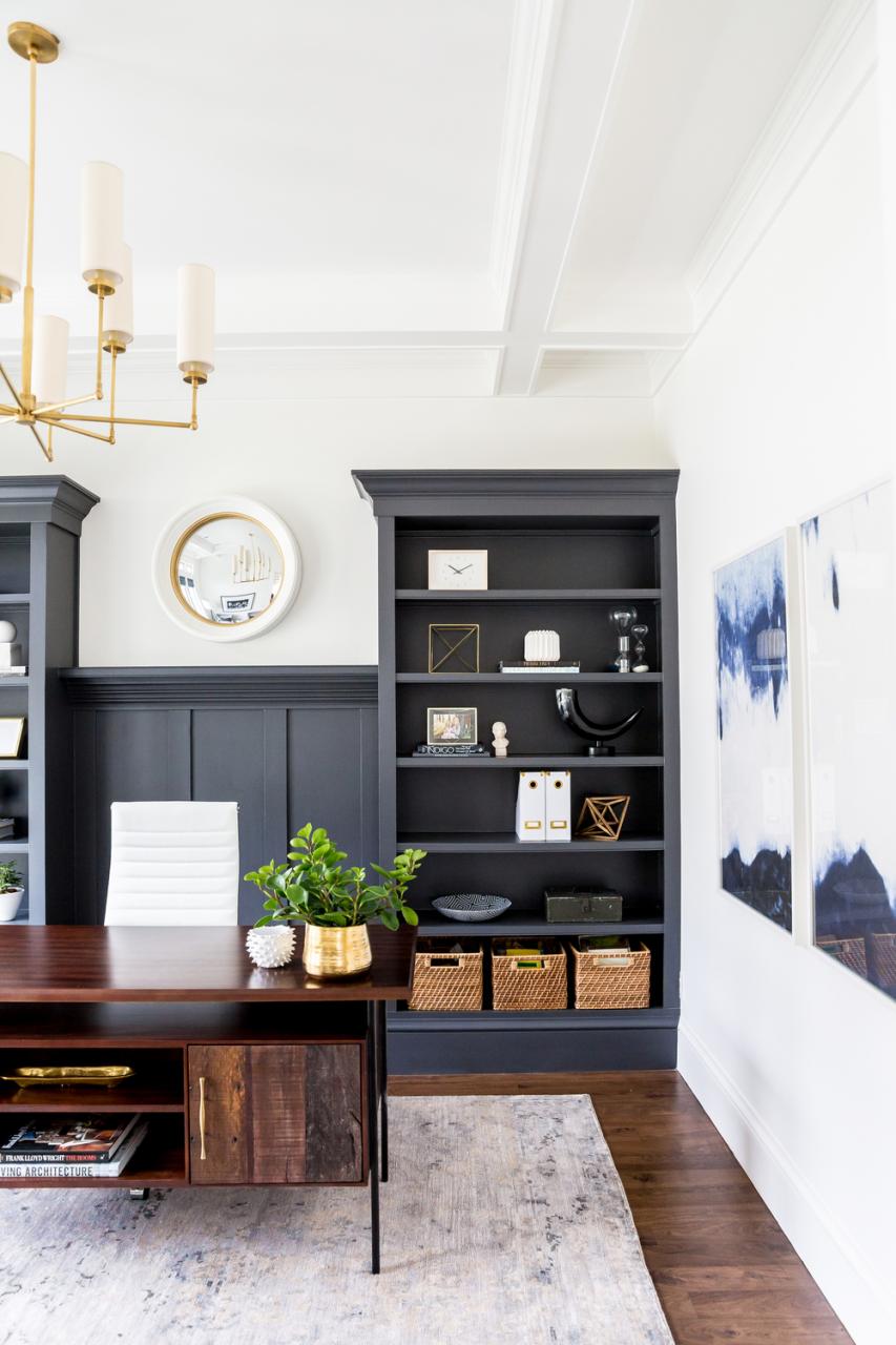
How amazing is the desk in the home office? It also looks like I need to upgrade my office chair for a white leather high back beauty!
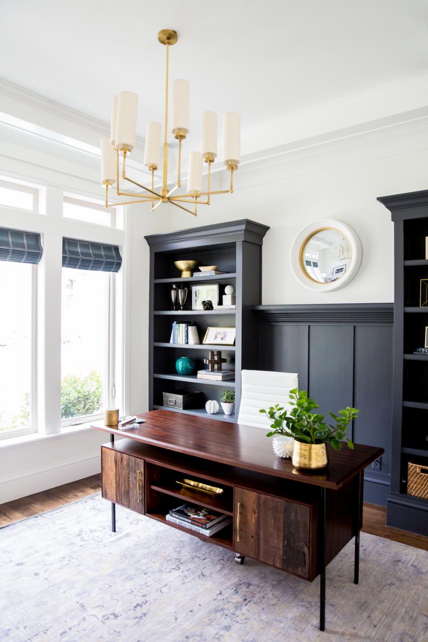
I also like the contrast of the dark built-ins and the modern brass chandelier.

What do you think about this house?
See more and read about this project at Studio McGee