


Pastel interiors inspiration
If pastels are done right, I love them. If not, I loathe them. The need to be cool and sophisticated, not sweet and sugary. Below is some inspiration I found for interiors that use pastels in a fresh and hip way.
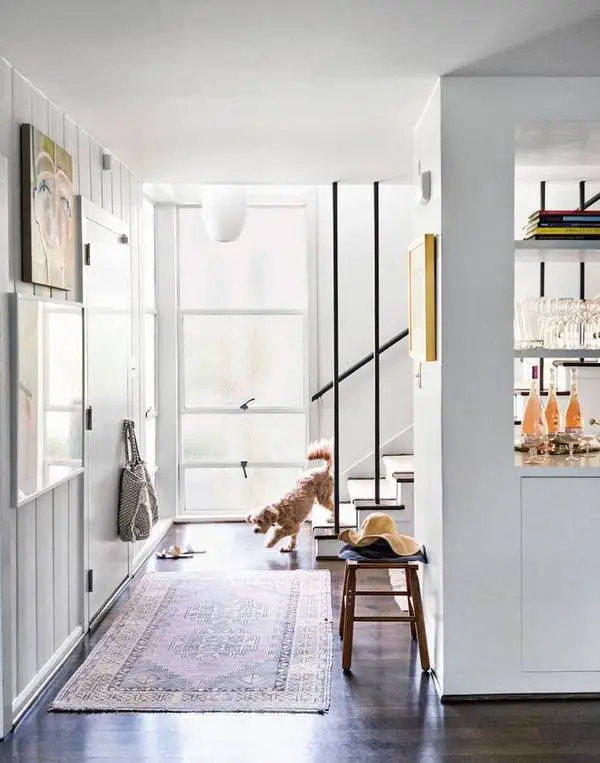
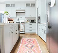
The super soft and muted tones in the rug and on the walls are like a breath of fresh air in this LA home.
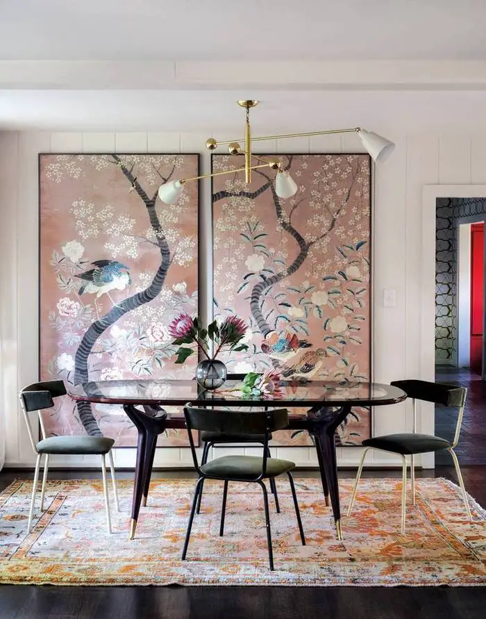
The blush panels in this dining room are made sophisticated by the sleek black dining room furniture. The pinks and oranges in the rug are just different enough to keep the pastels from being too matchy matchy.
2 images above via Domino
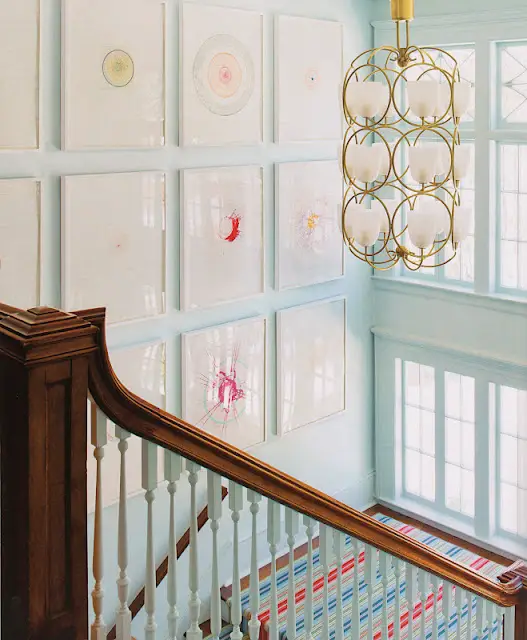
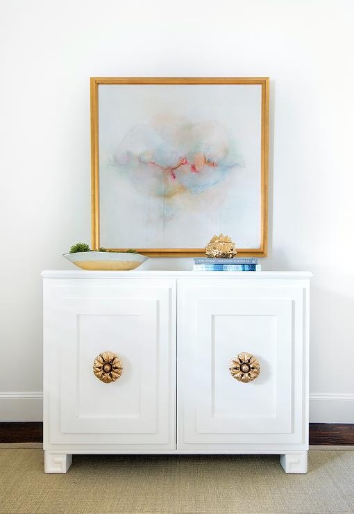
Pale blue and gold are always a winning combo in my eyes, and since no other pastels are competing, the landing doesn’t look like too sweet.
via Style Theories
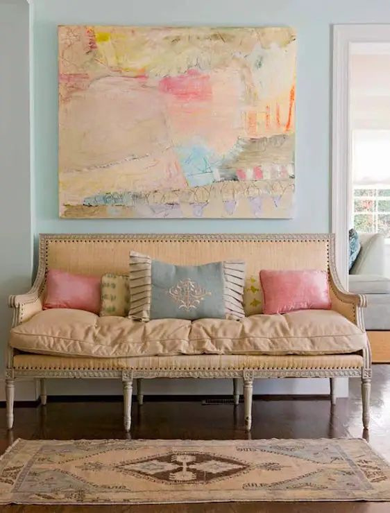
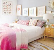
Usually the pink, sherbet orange and light blue together would be too much for me, but because the rug and settee have a time worn patina I think it works.
via Decorpad
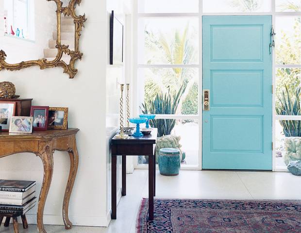
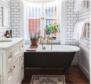
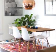
What do you think of the blue door? I think the subdued purple in the rug helps tone it down.
image above via Domino
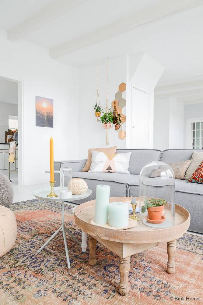
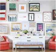
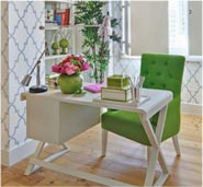
This space might be a little too pastel for me, but I love that rug!
image above via Domino
via DecorPad
Do you use pastel in your decor at all? If so, how?


